|
looking good man!!
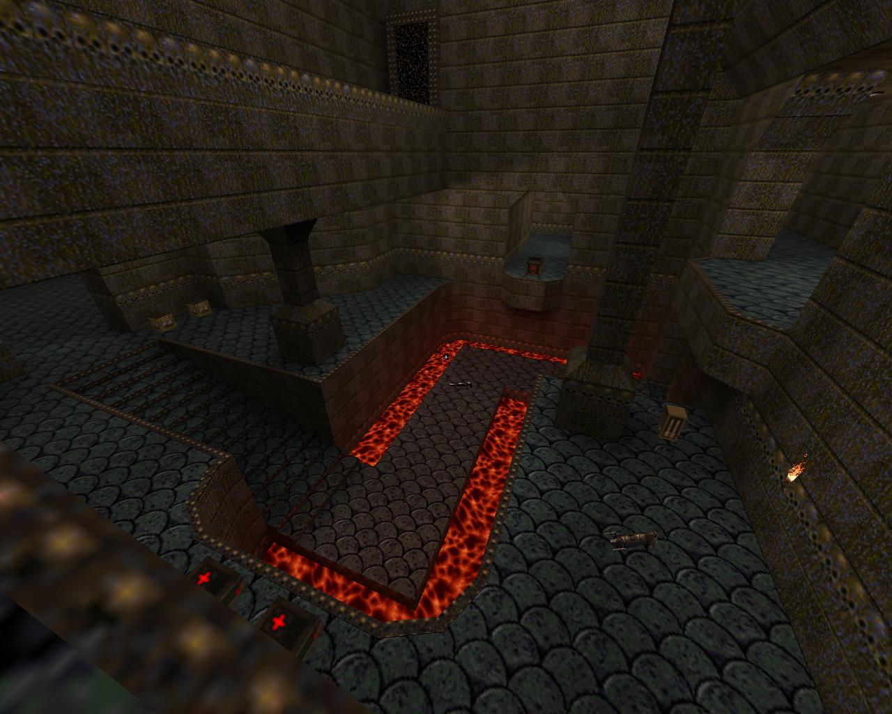
Interesting texture set, I haven't seen that one before. I'd probably have the floor texture as something that is a different colour to the walls for contrast. Also if you're using coloured lighting then I find picking 2 colours works well... Make them quite subtle so it adds tone but doesn't make the map look like crayola. https://www.dropbox.com/s/0tb6qoepfyno6e6/lightingexample.jpg https://www.dropbox.com/s/qy4rektk41ddgma/qon1.jpg Having 2 tones adds a lot to a scene what's up with the water? Looks like the faces got split somehow; check that the textures have the same alignment and offset as that will prevent the faces looking like one smooth bit of water.
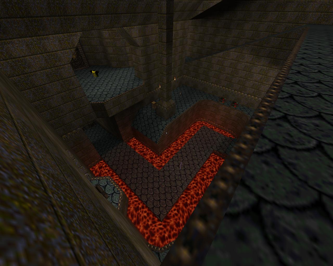
Yeah looking a lot better with the contrast... dunno if I would have chosen magnolia for the floor but it's your map!
Necros is correct on the water, make sure the water texture is aligned otherwise the faces will split and it will look weird in the engine. (I usually select all water brushes and reset their alignment and it will fix this for you) Yeah, I call that a "GL seam". Any time there is the slightest difference between the textures, you get one. Rotation, pixel color, offset, etc., any difference at all. In this case, I'd guess the scaling is different.
Scampie map - awesome, keep it going.
Fifth map - awesome, keep it going. Zwiffle map - awesome, keep it going. Pixels - pure shite but who gives a fuck at least we can easily make the game look good and proper with the usual GL renderers. Pixels - pure shite but who gives a fuck at least we can easily make the game look good and proper with the usual GL renderers.
nice opinion u got there m8 Where everyone plays favorites and everyone is in bed with everyone else whilst comparing who has the biggest and thickest map to use to violate everyone else.
Mentioned in #12510 and some following messages, Enclave is on Steam sale until the 5th. Amran posted some screens of his custom map for it, if you don't remember.
The game is also being given away for free (in the form of a Steam key) with every new account on DLH.net! I released a version of the map a while ago, and also the source for it if anyone is interested in a closer look. I'd be excited to work on more content for the game, and a collaboration with others would be interesting to do as well. The link to the map is below (and the source files can be found under the 'downloads' section). Northern Watch (on ModDB) More information on the map and a progression video are included under this topic (Ogier-Editor). http://imgur.com/Nl2ZTCk ive looked at all sky textures and changing them to moving every brush to a different location to moving lights. Why is this little bug happening? Bengt Jardrup light tools. Thanks for the help. Sorry Shambler for something k?
http://imgur.com/Nl2ZTCk ive looked at all sky textures and changing them to moving every brush to a different location to moving lights. Why is this little bug happening? Bengt Jardrup light tools. Thanks for the help. Sorry Shambler for something k?
not sure.. I would see if my light tool makes any difference: http://ericwa.github.io/tyrutils-ericw/
Also, what engine is that? There is a bug that 64-bit engine builds can have that looks like that. Check in quakespasm? Right - technically my first almost finished map (started on spz1dm2ftk after this)
Somewhat inspired by cpm3 and Aerowalk-ish. Feedback welcome. Screenies: http://quaketastic.com/files/spz1dm1_1.jpg http://quaketastic.com/files/spz1dm1_2.jpg http://quaketastic.com/files/spz1dm1_3.jpg http://quaketastic.com/files/spz1dm1_4.jpg Known issue: Textures on 2 spots not lining up after compiling yet it's correct in TB. http://www.mediafire.com/download/0aczfxuv8cnfcvl/spz1dm1.rar http://www.quaketastic.com/files/screen_shots/5thdm1a.jpg
Basically an expanded DM1 style map, heavy influences in places and straight up rip off in others. Looking good so far.
I think on the walkway on screen 2 you should stick some trims on there. Screen 3 there should be a little extra detail, lots of flat space that could do with filling. All in all though this is a really lovely looking effort for a first map, you should be proud. Looks very classic id. nice
one day I wanted to combine all e2 maps (except the base, though even that could be used as a "gateway point" across a bridge or something) into one giant megamap. Riffing on the original content is always interesting. Your shot looks suitably eldritch! I made you a demo with all my thoughts on your map... I'm hoping it's constructive. I think your map has loads of potential.
http://www.quaketastic.com/files/demos/5thspzdm1.zip Thanks dude. I like the idea of the having a mega-map made from an episode. Though I would probably choose E4 because I'm a sadist.
Actually there's quite a few places in my map where I took inspiration from Episode 4. For example I didn't use the 64x64 sized buttons, I made Sandy style thin buttons (the tall brick style with the sword?). I also threw a bunch of spawns in there too, very under-used enemy that doesn't feel unfair if you stick em in the right place. Thanks for the feedback. I'm visiting family but will check out the demo when I get home this evening. I've been trying to think of ways to fill out the SNG / RL room and even the platform it's on now was only added before upload.
Fixed the stairs near GL, wasn't really very fond of that setup myself. Trimmed the lava walkway. I was only aware of the grenades that get stuck on down angles and not the look down thing so will see what I can do there, Contemplating a room through that wall and maybe shifting SSG + GA there. The 1 unit lip on the trims came from q3dm6 but I was very much in two minds about it, flattened it again.
The weird angle near the bottom RL is also intentional as the stairs are clipped off to allow for angle jumps. You can jump from the bottom stairs onto the platform with the TB (and if timed correctly up to the YA from the pillars angle too). I figured lighting is going to be an issue for me. Still looking for decent lighting guides. Things that say "If you're having this issue try this" etc instead of the current "this command does this" versions out there. Having big problems lighting spz1dm2 due to this. Might have to move some weapons around and maybe even drop TB entirely. I stayed away from powerups due to wanting more of a 1v1 map but have contemplated a TDM version featuring an extra room or so with at least a Quad. Thanks for the lots of z-axis comment. Was definitely a theme I was trying to go for.
|
| You must be logged in to post in this thread. |
| Website copyright © 2002-2024 John Fitzgibbons. All posts are copyright their respective authors. |