|
While mapping some idiot samples of a distorted Escher map I came to the point to add the TurnWig to the level. Faintly the thing came up with a 3000 vertices model.
After a few days grimming on giving up I found a movearound with *.obj transport that minimized it back to the save zone of 800 verts. Now wait till it starts rolling against the walls. :P I have an skill 1 demo of your map.
http://quaketastic.com/files/demos/sc_csmn_beta2_cocerello.zip It is a good map, solid and well balanced. The lighting is adequate and the secret i found was well planned. On the other side, the map is too straightforward, as it is most of the time just staying on the place and shooting at the front. I think it needs some more ambushes or enemies from the side or a different floor, like it is on the two slime areas or at the silver door. For example, the encounter at the silver key would be a lot better if making the room a bit bigger and teleporting the enemies to the sides or at an upper floor, while being careful that the player not just stays at the door shooting. Other way would be to change some more corridors into T sections that end soon and place the enemies there. Another thing to take into account is that the map can be finished even in skill 2 with only the SG and even leave withan almost full caché of shells. I think you should change some big shell boxes for normal ones, like the one with the NG. I would also make it so the jumping grunt at the beginning will ot aggro till the player is inside the room. Reworked some areas. Added some stuff.
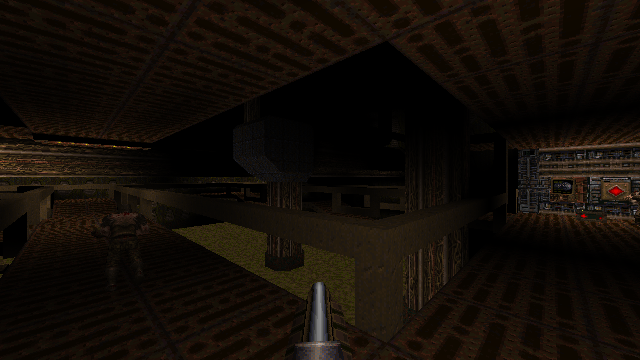
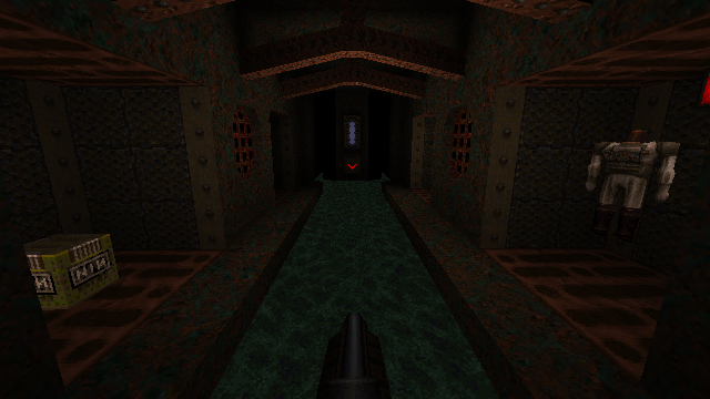
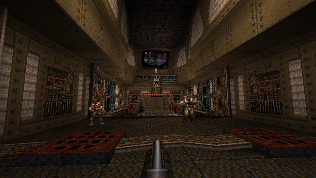
A little more light and monster/ammo tweaking should be about all. Should be a slight improvement over beta 2 I hope. http://www.quaketastic.com/files/sc_CSMN_beta3.zip Pics of tweaked areas http://www.quaketastic.com/files/sc_csmn_beta2_1.png http://www.quaketastic.com/files/sc_csmn_beta2_2.png http://www.quaketastic.com/files/sc_csmn_beta2_3.png Here's a Skill 1 demo with commentary throughout.
Things I liked: Nice little old school map. I prefer shorter maps so this was great for my tastes. The secrets I found were fun and rewarding. I liked how you wove in some outdoor areas here and there. I'd suggest adding more if you want. i.e in the the silver key area you have an enemy fire in at you from outside. That was cool. The exit room was really nice. High contrast looks great in there. You have some nice multi-stage contraptions (silver key room) - more of those would be awesome. Some things to consider: Base maps are kind of hard to nail because they can get "busy" very quickly if you use a bunch of colorful textures. You have some very "vibrant" areas in the map that are almost too much to look at. So for example you have some doors with big yellow light textures surrounding them. Some of those are a bit much for my tastes. But this is a subjective thing. I think overall you have a decent looking base map here. As far as gameplay. It's an easy map.I am going to go back and play this on hard to see any differences. Many of the enemies are on the same plane as the player. That's too Doom-y for me. There's one area where you have enemies attack from above though. That took me off guard because it was rare in your map. You may want to mix up some of the elevations in the map where possible. You had some dead end areas and that's okay but I was a bit confused here and there as you'll see in the demo. Also maybe mix it up a bit on your doors. I missed the nail gun area completely. If you had a "see thru" door that showed me the gun was there I would have noticed it. As it stands, you have some doors that are unlocked and some that are "opened elsewhere. One last thing: those "phat" railings in the central slime room are out of control! I'd re-work those to match some of the better railings in the map. Makes for much better visibility. I didn't notice the hatch until much later for example. There are some buttons you need to fix the lip and add wait -1 after they are tripped. Little fixes here and there. Okay, that's enough from me! Good job. Keep mapping and enjoy yourself. Some more tweaks ect.
Hopefully should be the last construction build and will be moving on to monster placement ect ect. http://www.quaketastic.com/files/sc_CSMN_beta4.bsp Even the stone itself mocks your plight.
https://cdn.discordapp.com/attachments/348561852990488579/731998822867140748/unknown.png I did some mapping with LibreQuake textures. These work-in-progress maps might or might not show up in LibreQuake (they're not official by any means), but I strung them together to form an impromptu mini-campaign. Perhaps some enjoyment can be derived from giving these maps a go.
https://maikmerten.de/maps/savlqmaps/ **********************
SLIGHT SPOILERS FOLLOW ********************** Fun little mini-episode. I'll have to go back for the secrets I missed; enjoyed the ones I did find. The ending of the last map made me chuckle. Some thoughts: The good: I really liked the first and second map (and the transition map was a cool effect). Got a little lost in the second one and found myself looped back to the GK door without having encountered the GK itself -- had to go back and find an area I'd missed. Maybe that's just me, or maybe progression in the second map could be tweaked a bit. Quite a few of the textures are really nice (which is more feedback for the LibreQuake team than for you specifically, I guess) and I really like the old-school-but-not-quite architecture, which I often find more charming and interesting than every-brick-is-a-brush excessive detail. The less good (in my opinion): The horde fight in the first map feels a little too climactic for the first map in an episode. On a related note, you were also a tad overly generous with the weapons here, leaving pretty much nothing new to be found in the second and third maps -- particularly if the player finds all the secrets. (Since you wrote that you just pretty much just glued together a few maps in an impromptu fashion, I guess this map was not necessarily meant to be the the first map of an episode, so my criticism might not be that relevant.) In fact, in my opinion both horde fights (in the first and last map) kind of clash with the old-school approach the maps otherwise follow, as do the use of so many high-tier monsters. Perhaps not much of an issue now, but I wonder how well this kind of gameplay would fit LibreQuake's vision. Plus, I just find horde fights boring (but that's just me!). The ugly: Sorry to say this, but the start map is really ugly (I don't mean the two jokey textures; I liked those). The final map was also a bit of a let-down after the other two. It feels perhaps a bit unfinished (WIP, I know), with a few areas being maybe somewhat underdetailed. I mean, I like the restrained aesthetic overall, but the final map features a few too many large monotextured blocks. It was also a little disappointing to see so many textures repeated form the first map, which made this one feel less like a separate place. It would have been nice if it had more of a distinct identity, especially after that transition map. Overall, though, I enjoyed this. It's made me excited for LibreQuake. Thanks for sharing. threekidsinatrenchcoat, thanks for giving these maps a try and providing your thoughts!
I'm glad you in general seem to like maps one and two - those are "new", while the third map is a retextured version of my SM181 entry from a while back with a few tweaks here and there. I resurrected that one mostly to give the LibreQuake textures a try. Being satisfied with the quality of the textures, I created the other two maps. I guess the retexture did nothing to hide the speedmap roots ;-) As you have noticed, the weapon progression in the impromptu mini-episode does not make a lot of sense. As fact, all maps right now are designed for a "shotgun start" and it is as of now unclear in what episode and in which slot these maps end up being (in fact, it is unlikely that these maps will end up in the same episode). The "shotgun startability" means each map is keen to provide ample of supplies, which feels overly generous. With a proper placement being settled on, it then should be possible to redistribute weapons and items accordingly. I assume you'll be happy to hear that this particular start map is not LibreQuake's start map, I simply slapped that one together to have *something*. I'm glad I did not invest a lot of effort into that one, for the following reason: Given that each map is somewhat "standalone", the start map perhaps instead should be a "map selection hub" and not just a difficulty select. As such, the premise of the current start map to be a "quickly thrown-together classic Quake start map" may be flawed. As for missing the GK on the first run through the loop in map two: I'm somewhat surprised that players don't seem to reliably notice the brightly lit gold key placed in plain view in an otherwise dimly lit environment. You are not the only one that left the GK behind, so I guess I might have to prevent players from leaving the area too soon or have a stronger visual cue. Thanks for the detailed response!
Funny, I hadn't recognised sm181_savage under the new coat of paint, but of course it's so obvious in retrospect. I played that map back when it was released and found it incredibly impressive for a speedmap, both in terms of visuals and gameplay. But I guess one holds speedmaps to a different standard, even if just subconsciously. Sorry to have been so harsh regarding the start map. I knew it was quickly thrown together and not meant as a "serious" start map. I just felt that it was unnecessarily off-putting, given how nice the actual maps that follow it are. I had another look at it and don't really mind the relatively simplistic brushwork and layout. The clear homage to the id1 start map is charming and cute. My main problem with it is the texturing. And not actually the textures themselves -- I just think they're really not well-chosen for the spaces; especially that brown brick texture in the main room of the start map. My first thought when moving through the start map initially was "ugh, the LibreQuake textures still need a lot of work". However, the subsequent maps clearly show that the textures can actually look really good when used properly. Seeing that the LibreQuake textures are sort the raison d'etre for this map pack, I think it might be worth ensuring the player's first glimpse of said textures do them justice. Err, sorry if I rambled a bit there and if it still sounds overly harsh. I hope you get what I'm trying to say. Given that each map is somewhat "standalone", the start map perhaps instead should be a "map selection hub" and not just a difficulty select. That would certainly work. Swampy feels like it could be part of a longer episode, but castellated can (/should?) certainly stand on its own (perhaps it's worth considering releasing it on its own -- you know, as a "proper" release?). I was going to suggest swapping swampy and castellated around as an alternative solution, and just tried that out (by renaming the bsps). Gameplay-wise it does flow better this way, but aesthetically I have to admit preferring it the way you've set it up, with castellated as the first map. By the way, in case you do decide to turn the start map into a hub and have each map be played as standalone: when I played through swampy from shotgun start, I found there to be frustratingly little ammo at the start (skill 1). A couple more shells wouldn't be amiss here. The rest of the map played fine. The rest of the map played fine.
Just to clarify (probably needlessly, but hey, why not turn an already embarrassing triple post into a quadruple disaster): I mean that it played fine in terms of ammo balance. Didn't pay so much attention to other aspects of the map and what I wrote earlier about the GK progression still stands. Obviously the second time around I had a better idea of where to go first and I was basically just rushing through it to get an idea of how swampy and castellated would play if swapped around. Thanks again for your kind feedback and detailed response. Given that the start map will shape the first impression for most people, I guess that putting in some extra effort there does make sense.
Thankfully I still have a rather intricate start map lying around from a scrapped project - and it turns out that the LibreQuake textures work really well there: https://maikmerten.de/maps/savlqmaps/newstart.jpg My pleasure.
Loving that new screenshot; I'm jealous of your terrain work. I do have one last very general bit of constructive criticism; please disregard if you disagree. I really like everything you've released so far, but I do feel like your maps -- at least in part -- have a tendency to be slightly overscaled. This was more of an issue for me in dreadbase, many areas of which I thought could have been scaled down quite significantly. Still, in the two new maps (castellated and swampy), as nice as they look, I felt that many parts would have looked even better were they just scaled down ever so slightly; perhaps by about 10%. Certainly not to the point of becoming cramped; just so as not to feel overly spacious and empty. One clear example would be the near-circular room with the fiends and the pool of blood. Not that I'm suggesting you redo anything in these maps, but maybe it's something to keep in mind in future. Then again, what do I know? :) Well, yeah, scale in Quake is hard.
Quake guy seems to be rather short, while moving unreasonably fast. My major point of reference for scale is doors, then scale the rooms accordingly. In castellated, I chose 192 qu for door height (wizard doors, as in e1m3). These doors indeed dwarf the player, and so do the rooms. This is not unintentional for magic castle-libraries with "you're not welcome here"-architecture, but may still be excessive, so I *do* see your point. In swampy, doors are 128 qu tall and the map *is* built to a smaller scale. Of course, I still like my big cave and outdoor areas... farty is the oldest of these three maps, and also has 192 qu doors. So the scale here should be comparable to castellated. Scale is a topic I'll have to keep in mind. What's going on with your Base map? I just played your Beta1 and then Beta4 (didn't see it until later). I liked the changes that you made along the way!
I think you'll find that the current snapshot available at https://maikmerten.de/maps/savlqmaps/ now features a much improved start map.
Indeed!
As was already clear from the screenshot you posted, the terrain work in the map is really nice. And I agree that the LibreQuake textures work well in this map -- although having reddish fireballs emerge from yellow lava looks a bit odd. Love the way you integrated the notepad message at the start. :) The usual rl stuff and world on fire mental dread was keeping me distracted. Should have something around this weekend.
Thank you for the interest, kind of needed a reminder I was working on a map. Added and tweaked some enemy placements with a couple minor geo and lighting tweaks.
Should be the last beta (fingers crossed again) http://www.quaketastic.com/files/sc_CSMN_beta5.bsp http://www.quaketastic.com/files/sc_CSMN_beta5.txt Here is a demo of your latest beta (#5):
http://www.quaketastic.com/files/demos/csmn_greenwood.zip I like it! It's a nice little retro map. The only secret that I didn't get was the rafter quad (which I didn't need). Maybe you could change that with something more useful, like grenade launcher, because you end up killing everyone in that room before you get to it. |
|
|
| You must be logged in to post in this thread. |
| Website copyright © 2002-2024 John Fitzgibbons. All posts are copyright their respective authors. |