|
Thanks
1) Yeah it could be a little bit brighter. It looked ok on my screen, but I found it a little bit too dark on other PC too. So I'll keep this in mind in the future. According to your comment about map being unvised - map was VISed but I guess my pipes and cables are a nono, too much faces. And in one place I fucked up with func_detail and forgot to fix this - in a zombie corridor whole pipe is a func_detail LOL. ps thx for the demo, I'll take a look at it soon :) So it means Everything I did was pointless because nobody can see it. And because contest is over and I can't fix that for this, that really feels great. I just wanted be happy that everyone can Experience it same way as I did. I understand situation quite well, I am just pissed because of me.
How do I make it brighter, is there commands I can use when compiling? There is no way I can go through all the light entities that fast and rise up values.
Also that glass thing in screen actually it worked on higher light values, but it also lighted too much room and that's why I just leave it that way..
Quick and obvious tip for making sure the light levels in your map are not miles off.
1) Look at the lighting levels in your new map. 2) Look at the lighting levels in the stock id maps. 3) If there is a large disparity between them, then tweak your lights, and goto 1). Thanks for pointing out that there is no commands for increasing light's brightness amount. So basically every light entity needs to be almost 300, that's what you mean. So it's gonna take time to change all of those, but maybe that's the only way to do it.
Simple just increasing sunlight doesn't seem to work, because then some of the rooms becomes overly bright when comparing other part.
I have to say one thing, I intended it to be dark and not bright map, I purposely pulse lights so enemies will hide in shadows time to time. So I'm not quite sure are you guys talking about the the main default lighting or parts that are intended to be fully dark or pulsing?
Either way I'm going to work on that aspect to make it more pleasure to end-users with darker screens, but that's going to happen not now, later on this year.
There's a -range switch for Light that will alter the overall brightness. It works pretty well as long as all your light sources are reasonably balanced. Using surface light is another way to adjust many lights at once.
I used -gamma 1.5 for my own final compile when I saw the beta and was reminded that the default for Quake's brightness and contrast sliders is all the way down, not the 50% I'd been using. Quick solution at the last minute, but it worked. The wave of horror that washed over my face as I realized the stock id maps were designed for that low setting was something, but remembering the light documentation had mentioned a global switch of some kind was the most satisfying type of relief.
I don't think there's anything wrong with colored lights as your primary light sources. Real world lights all have some sort of color, and adding a similar slight tint in game lighting makes all surfaces the light touches take on a bit of the same tone, in turn helping them look like they exist together in the same place. The key is to aim more for color correction and less for party colors, since deep saturation ends up looking artificial and, as has been pointed out, darker than is likely desirable. Fine for special effects here and there, when called for, but not so much for main lighting. I ended up going a bit more saturated than I wanted to for most of my lights, but with my brightness and contrast set wrong and my panicked last minute rushing, my attention to those things managed to go by the wayside. Anyway, haven't had a chance to play the mod or watch the demos, but I appreciate the feedback so far, thanks! I'll be back with more detailed comments eventually. NewHouse: I think I was wrong about the secrets as you've probably noticed when watching the demo. A couple of pickups looked like secrets, but they weren't. Noclipping around I spotted some actual secrets and the triggers worked.
The glass trick is tied to the r_wateralpha value. Quoth has means to force a custom value when the map starts. Can't remember if the ceiling windows were fine or opaque, too. As for the lighting: a dark level is fine if the contrast is there. Obviously, monitor settings differ. As was said, checking your light levels against other maps is a good idea. Not necessarily the id maps, at least not as an absolute guideline, as they are fairly bright in comparison to basically everything. To give you some perspective: ionous', Bloughsburgh's and Tens' maps were fine on my setup, even if they had been slightly darker. I'm not an expert on colored lighting (sock plz!), but I think it's better to use colored lights in addition to regular lights. The latter for the general brightness, the former to add a tint around the source. Or something along those lines. If I delete the Khreathor: My bad. It's vised alright. Sorry, was typing while you posted, missed your comment. Yes, it was, he's this little guy. The dodecahedron and the pipes were also from the OBJ2MAP UV beta, with a minor tweak on my part for the owl to work properly.
The whole map was really just an excuse to play around with some new toys, if we're being honest. Not a terribly entertaining result, gameplay wise, but I had fun messing with all these different programs. Thanks again to Ionous for running this Jam! Great work everyone, that was a fun way to spend Sunday morning!
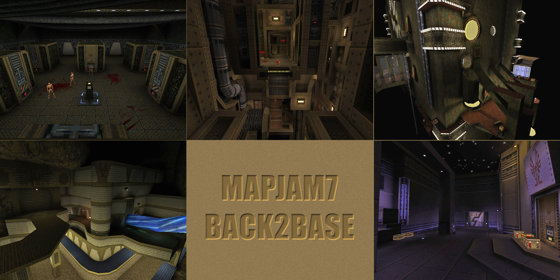
Start map: Ionous you did a great job, such pretty brushwork and short and to the point. Liked the NM entrance as well. ItEndsWithTens: Whoa, what a trip. The elevator ride put a little panic into me at first and was a nice intro to the level itself. One can't play this map and not mention the gigantic space...heart...thing that looms over no matter where you are. Lovely unique structure. I couldn't find a single secret but it was still fun to tour that odd place! NewHouse: Lots of atmosphere here, lots of cold vibes present throughout the entire level. I will have to say the overall lighting is way too dark. I could not see enemies or any possible secret switches/places that I would hope to find. However, from what I could see I had a great time. There is something cathartic about zapping base enemies with the thunderbolt...and you definitely provided on that! I also really liked the silver key spending idea. I didn't make it to the end but I got very close, the immense amount of spawns in the start area (After you grab the gold key) did me in when it concerns ammo. Fighting some of those baddies with an ax is not a pleasant experience! This was a great first map and I think you have a lot of great ideas flowing through your brain. Keep at it and I am looking forward to seeing more! Khreathor: Vending machines! That really makes you mindful of spending ammo when fighting others because it is the only way to get health and the like. The only issue is that you can use nails to "pay" for the machines which is far less expensive than shotgun blasts. One could exploit the nail vending machine this way, and by extension the rest. Maybe using trigger_damagethreshold of 20, you could have disallowed nail "coins" The map was super dark, but then again you do include a flashlight which is the only mapper to do so. Only issue is to find said light, you need to almost completely navigate in total blackness which I did not discover until the very end as you will see. Lovely gimmicks and ideas here...good stuff! Ionous: I can only hope to increase my brush making skills to this level. Once you step onto the center section, I could only stop and just pan around...absolutely gorgeous. For me, the gameplay felt a bit uninspired with seemingly just a pipeline you follow to wrap back to the exit. I didn't find the nail gun until the very end as well. Still the flow is very nice, but something seemed to be missing...maybe it is the absence of sounds sans a few here and there or something else. Still, you had to also create the start map and that should be considered. You are very much an inspiration as the Mire from AD is one of my favorites of the pack! This was a great pack and it was very much a challenge to complete...congratulations to everyone. I'll watch the demos and comment on those later thank you! My demos: https://www.dropbox.com/s/yk6xnya66l9eqhe/mjb_jam7dems.zip?dl=0 I gotta say I kinda dig the darkness in the NewHouse map, but I played on a laptop with a bright screen that tends to turn black into grey. And it was still pretty dark.
The overall feeling of the map was pretty unique. The darkness and the quite punishing balance (which is outlined by "choose your own miserable adventure" with the silver key) create a sort of a survival mood when you can't wait to get out. Which is often annoying, but in the case of this particular map I didn't mind. Even though it was frustrating at times. The unusual weapon set (weaker tools + an "emergency" LG) also added to the aforementioned feel. Enough with the meltdown already :P.
Your map is dark, yes. It's still playable turning the gamma up, just not quite as effective. It's fine for this release, just move on and tweak it or learn from it for the next release. What a relief to hear some positive feedback about the map's mechanics, those are always interesting to hear from others perspective. Also there is rocket launcher hidden somewhere.
Good pack, good turnout, good interpretations of the theme, well done everyone involved.
Interestingly, it seemed like a lot of people went for distinctive base-style trickery with gizmos, hacks, widgets, cunning progression, and secrets. Even if some designs were relatively simple, there felt like a lot of "modern Quake" touches going on, which was cool. A few things that stood out for me: Crazy progression around Bloughsburgers map, even though it was kinda a box, all the traversal methods were cool and the non-fatal void very welcome. The computer room in Newhouse's map, really cool collection of screens and consoles in that. I liked the ferocious but manageable gameplay early on until after the GK when it wasn't feasible on skill 2. Ionous's brush porn - well described by negke!! Well done Ionous you win the 90,000 brush challenge contest. The pipes in the main area especially cool, and the lights on the turbine. Incredibly lush brushes, but gameplay was over soon. I liked the curves and arena exploration in Tens map and the general build quality and cool details in Khreator's too.
|
| You must be logged in to post in this thread. |
| Website copyright © 2002-2025 John Fitzgibbons. All posts are copyright their respective authors. |