|
I already provided some input on quaddicted but demos are more intimate ;0
https://www.dropbox.com/s/df6h14v3e19zxpz/mjb_lane.zip?dl=0 So I'm pretty late to the party with this one, but I thought I would give my 2 cents anyway.
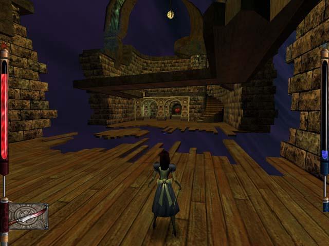
I really think you should take some time and flesh out the "feel" of the rooms a bit more. This gave me a vibe of the stuff that was coming out in about 97 / 98. It's by no means awful, it is just "simpler" than what we're accustomed to. Off the bat there are two things that I think would help this map greatly. One is rock terrain, have a look at socks articles (http://www.simonoc.com/pages/articles.htm) on rock walls, I have found them invaluable. The other thing to think about it lighting and maybe even fog. I know that fog requires a modern engine, but it allows for atmosphere in "void" areas. Alternatively hard straight edges on void areas also seem strange. Here is some "done" well. http://spyhunter007.com/Images/american_mcgees_alice_bottomless_void.jpg Here is your area, http://imgur.com/L09LUh2 Note there is no transition into solid geometry... The solid geometry just starts abruptly. You blended the void in quite well in the areas with the blue bricks and switch, you didn't follow it through to the rest of the map, I felt this was a shame. Regarding lighting, you could probably drop the brightness quite a bit, particularly in the earlier areas, this would add to the atmosphere somewhat. In terms of gameplay, I thought you did quite well. The encounters were well balanced, I was playing on normal and didn't die to any enemies. The open areas in the "end" encounter allow the player to run away and snipe things from a distance. I sort of cheesed the area. I'm not sure whether this was by design or a coincidence of your choice of geometry. If you were to shrink this last area I'm sure it would be a little tougher for players. All that aside, congrats on your first release. Well done :) Thanks for the feedback, Shamblernaut. I will take a look at those sock articles. As for your comments on the void bits, I agree--I do seem to have gotten lazy in some places. Creating an impression of blending into the void is doable with bricks, though I also like the idea of solid metal structures floating in space--maybe the two can work together with metal trim on the edges of the brickwork (something I started to do on a map I'm working on now). It's a balance I guess.
In general I was going for an "old school" vibe, and still am in my current project, but I want to strike a balance between that vibe and certain "improved" level of detail. I love modern obsessively-detailed maps as much as anyone but I want to capture something maybe a bit "retro-plus"! We'll see how it turns out though.... Lighting is something I definitely need to work on. Again, thanks to anyone for the feedback--it's been really helpful and encouraging.
|
| You must be logged in to post in this thread. |
| Website copyright © 2002-2024 John Fitzgibbons. All posts are copyright their respective authors. |