|
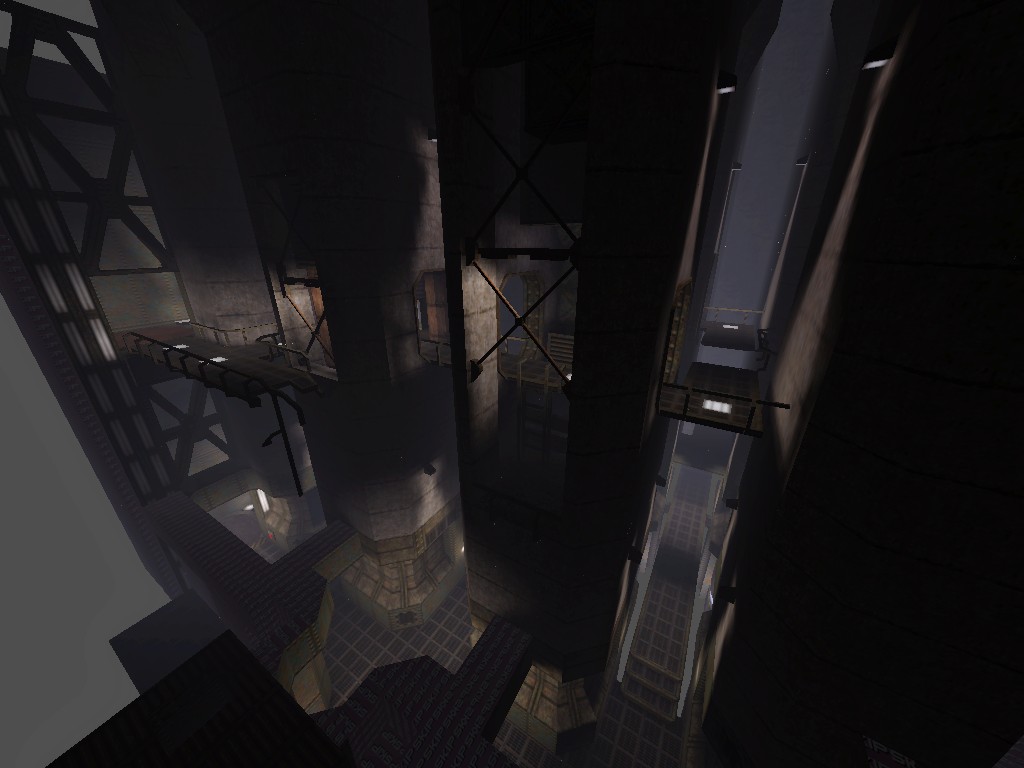
I like your stuff, sock, but I really wish you'd change your lighting style when it comes to those yellow inset windows. The light would in no way be able to hit the walls like that and it just looks
This probably wouldn't work, but could an info_notnull with effects 8 produce a fake volumetric glow for the window effect?
Hm. Even if not, might be useful for marking buttons or other stuff, will have to give it a try. but I think they would be better if they were a bit more orangy like the one on the left? opinions opinions...
Looks very nice. I also have to agree with a couple of comments.
I think the upper square window has too much of a greenish tint, more to the orange side would look better I think. And the way the light from it illuminates the surrounding wall is a little unnatural looking. That light would have to be reflected back onto the wall and there is nothing there to do the reflecting. What I had in mind...
click About the lights being unnatural, I think the windows would stick out much more without them. It's okay to sacrifice realism for improved local contrast, imo. Plus you need some kind of light source for lighting those parts anyway. Doesn't bother me much. That literally looks like this http://multiplayerblog.mtv.com/wp-content/uploads/2008/08/diablo-fan-06.jpg
is that a remake of e2m1? (I got that impression, or at least an e2-ish impression, from the moat/drawbridge type setup).
Looks amazing. Extremely atmospheric. ps, I always light windows like that. if it's inside the light must be coming from outside, if it's outside the light must be coming from inside, heh. I guess what hits me wrong there is not necessarily that it's physically inaccurate but more that it makes it plainly obvious that there's a spherical light source sitting in front of the window. I dunno
I agree with willem, FWIW
The current technique would probably be fine if the light was more subtle. Currently it's bright enough that it has my brain looking for a source. Dimmer and I might accept it as general ambient lighting bounced from somwhere else. I think it's the fact that the sky is the only thing in the scene with that color. When compositing a scene you need to repeat the main hues in several locations in a scene or it might look off. Ditto for the windows actually. It doesn't need to be as bright or saturated either, just repeating a certain set of hues already helps a lot. I tried to tone it down to bring it more in line with the rest of the scene, but ideally there should be other things in the set that share the color palette.
https://www.dropbox.com/s/h13yssu9o5hq6wb/telefragged_001.png
https://www.dropbox.com/s/l2h6b9okm8zq8d8/telefragged_002.png Yeah, dropbox. Sorry I'm in a hurry.
|
| You must be logged in to post in this thread. |
| Website copyright © 2002-2024 John Fitzgibbons. All posts are copyright their respective authors. |