|
I scaled down as I wasn't sure about how to use them. I won't release anything until i see the full set to be honest, if these initial textures are anything to go by this should be really nice.
Also I probably should have gone to bed rather than mess around with these. I will keep a close eye on this thread. * Ptoing:
- Purplebrick: looks good, with a strong personality. I'm also waiting to see a purple texture set, and if there is a orange and pink ones, even better. As Fifth said, i also see that they aren't very Quakeish. It's good because that gives us the option to make maps with a different feeling, but most mappers prefer to make Quakeish maps for Quake, so it can affect how many people will use them. Something that had bugged me is that in my eyes those are blocks, more than bricks, at least in size. Apart from the size, i can't tell for sure if that is stone or brick. In Quake, bricks are usually smaller (8-12 units high), like ID's city1_x and city 2_x textures. Check Quake e4m7 for reference. Don't misunderstand me. It is good to have bricks so big, but it is probably better if bricks so big aren't common in the texture set, except if that is one of the charms of the set, if it is like that, ignore what i said about their size and keep going like that. - Weirdrocktest: looks good as well, as a desert rock texture, but the tiling is a bit obvious: In a normal texture that wouldn't be much of an issue, but rock textures are often used outdoors, where most brushes are well and homogeneously lit, very big and you see them from afar, so the tiling is way more noticiable (in this case, the whitish zone in the upper-left corner). Try to make all rock textures at least 128x128 and make some 256x256 or maybe 512x512, and check that there is no point in them that stands out noticiably (in this case probably getting rid of the whitish zone is probably enough). Well, most of those tips are in Rorshach tutorials(at the bottom of the page), so it is probably better if you read them directly than me continuing to write. *Hipshot: looks decent for a first try. It would need something around the door, a frame, or better, some rockish detail. Glad you are coming back to the dark side of mapping ;) . Any requests? I remember when I posted my Quake 3 WIPS here that people said that certain themes were done to death. I can only promise to do my best but it would nice if it's a theme people would like to see.
I'm also open to continuing unfinished stuff that people don't care about anymore. Just hit me up! > I'm also open to continuing unfinished stuff that people don't care
> about anymore. Please, check this thread : http://www.celephais.net/board/view_thread.php?id=61065&start=19 Two very nice maps almost finished, that were scraped ! :-( Rather you build with a theme you want to build with and that you have ideas for, regardless of what other people feel like seeing. Make us not tired of e3 metal!
Thanks for the feedback, I appreciate it. Just keep in mind that all of this is super WIP.
The main difference from Quake stuff is that they do not have as much colour variance, though there will be versions of them which will have that. But probably clean colour ones too, like they are atm, can't hurt. As far as the size goes, there are plenty of textures in quake with stones/brick/whatever which have the same dimensions, just one a smaller 64x64 texture instead of 128x128. But yeah, there will be bricks/stoneslabs of many different sizes, don't worry about that. The weirdrocktest is just that a weird rock test, and I am well aware of all it's fault, I have been doing pixelart tiles for almost a decade professionally, so I know about hiding the grid and all that. Those tutorials you linked me to do not seem to be there, but I am sure I have read similar stuff before. And I could ask Kevin the next time he is in a hangout I frequent as well. Well, if you just want a theme that no one does. How it sounds a map for DoE expansion, in Alice textures, that relies heavily in rings of invisivility, and fully geared towards DMSP or COOP?
i think there's definitely room for some more strongly coloured sets. some great maps have been made with the terracotta textures recently... Terracity and Red Slammer come to mind. They have an almost stylized strong orange theme moreso than e1m5, for example.
For sure. I think the Quake palette can produce some pretty funky stuff, but there are not many textures in the default set which use the more "non-earthy" colours in a broader way. Those are mainly used to add accents to other colours. Such as the purple and cyany colour.
Ok, no problem. I'll be expecting your work eagerly. Keep it fun for you. But
Well, if it is easy as you say to make colour versions of existing textures, maybe i could try begin to learn at texturing by doing that. I always wanted, but never knew where to begin. For now i am getting info on the issue till i begin with that. I have been doing pixelart tiles for almost a decade professionally, so I know about hiding the grid and all that. I know that you have been working as a pixel artist, and checked the links you provided, but by basing myself on those i though you worked in videogames with art similar to Monkey Island, for example, which is a very different work to texturing, and because those tips, even if they sound basic, i have seen them not present in enough famous videogames to put that info there for just in case Those tutorials you linked me to do not seem to be there Rorsarch tutorials are there, but not the video ones, those are probably lost forever. I was telling you about some text based ''tutorials'' at the very bottom of the webpage, below of where it says: ''Various help pages'' and ''MAP TEXTURES''. I suppose you probably know what they tell, but even with that, check them if you are bored, they are short, but kind of the base of texturing in Quake's community. Thanks for the comments. I'm very impressed with the unfinished stuff by Bal. However, I wouldn't have expected otherwise from him. Having said that, it's way out of my league but I still feel I could at least mess around with it. Quake and SP level design is completely new to me so having such an amazing base to start from is pretty convenient.
In the read me he says that all the content is unreleased Nehara stuff. That's a mod I was unfamiliar with (relatively new here). Does this mean I can't use the textures he used? Does anybody know this? Yeah, I will make variants, I said that already :) Atm I am doing a less bread and butter texture because I was bored of making bricks, haha. Gonna post it later.
And yeah, editing textures is a good way to start I guess. I have done tilework for Wayforward, specifically on Aliens: Infestation for the DS, which was very limited in terms of colours and tile usage, good practise. And I have done other tile stuff before where you have to try and hide the grid. But I see where you are coming from. Ah, found the tutorial stuff. It's under help. Will have a look a bit later. Just read some of his texture stuff and I actually disagree with some of his do's and don'ts. Specifically saying to not work at scale. I think working at scale gives you more control at the pixel level, because if you scale down shit will go to mush.
Another thing is that he does not seem to like textures like the bricks I done based on scale, saying the bricks are too big. I would disagree there too, especially in a game like Quake where epic/monolithic architecture works really well. But yeah, the stuff where I agree I already knew. when you�re at it, make some gigerish alien stuff too.
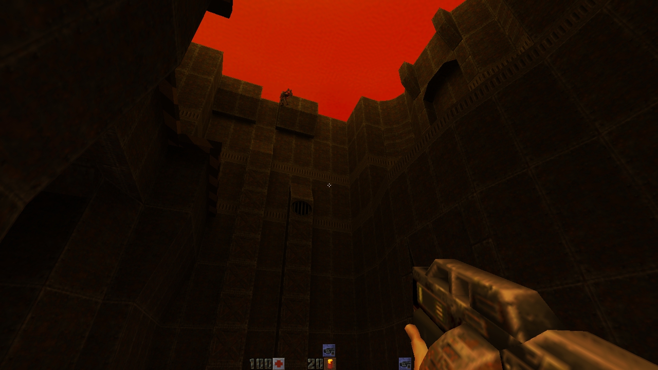
Black slime tech mutation.. Please, please. At full scale those texture do look pretty nice. In this picture it looks a bit like a cake but I reckon if you stick to the same colour range it will look good, just flat purple was really nice. (no this isn't a proper map, it's the shell map I made that ended up being my jam 2 map... I use it to test texture themes)
https://www.dropbox.com/s/suhl6p3t3zhkffn/ptotex2.jpg mfx: Noted :) I quite enjoy doing Gigerish stuff.
Fifth: It does look like cake, yummy layercake. SleepwalkR: Yeah, they are quite clean, as I said before, these are a base pass before mixing in other colours, doing "moss passes" and what have you. I think I will provide these clean variants in the pack as well though, because that can't hurt. Would be neat to have a map where stuctures get more and more decayed as you go along. And here is what I been working on today. Also still WIP. And NSFW. https://dl.dropboxusercontent.com/u/15588722/post/func_msg/basrelief.png And there will be several broken versions, colour variants, splattered with blood (offerings to the goddess) and so on. And probably runes on her sides below the hands and besides the head. Variants are a lot of fun to make once you got a good base to work from. I think I will provide these clean variants in the pack as well though
PLease, please, do that, as long it isn't extra work for you. You can always put them in a different Those so pure textures look suitable to Alice and other videogames in very weird surrealistic worlds, by looking at that screenshot.
Problem with that kind of texture combinations it that they usually require to keep the number of shadows to a minimun or give the map a minlight of 50 or more, because dim lighting makes all colours more similar between them. The good part, or bad depending of how you look at it, is that that issue is more prominent with ID textures, due to their similarities as usually they share at least the third most used colour in each texture. In fact, I tried to do a colorful map in ID textures and ended like that, so had it switched to brown-green textures, as dim lit areas is part of the gameplay of the map. Looks good, I like the texture blend of the rock and grass... would look nice at the top too!
Yes it would, I'm just gonna figure out the best way of doing that on those angles, in this engine =)
|
| You must be logged in to post in this thread. |
| Website copyright © 2002-2025 John Fitzgibbons. All posts are copyright their respective authors. |