|
Good idea, Daz.
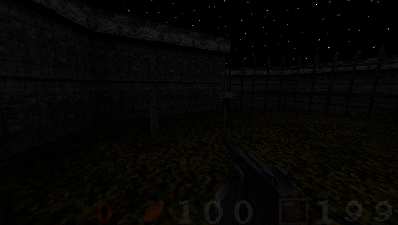
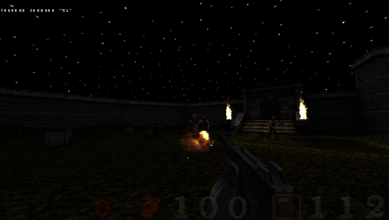
Love your YouTube vids. Here are some pics. http://www.quaketastic.com/files/bloodquake/bloodquake20160531201021-00.jpg http://www.quaketastic.com/files/bloodquake/bloodquake20160531201046-00.jpg http://www.quaketastic.com/files/bloodquake/bloodquake20160531201145-00.jpg http://www.quaketastic.com/files/bloodquake/bloodquake20160531201233-00.jpg http://www.quaketastic.com/files/bloodquake/bloodquake20160531201308-00.jpg I just tried to load the mod in Mark_V and I got a crash to desktop error. "Bad FOV 180"
I tried in Quakespasm and I got a crash to desktop error saying that "progs/cyborg.mdl is missing". I'll go back and debug it as much as I can in order to have it run on other engines.
Thank you all for the feedback! I tried this out last week in darkplaces and encountered several visual bugs and a ton of console spam. I've been meaning to tinker with it and try it in other engines.
I dig the project and am looking forward to the debug! I'm in the process of making my first map, and could use some advice especially with regard to texture choice, lighting, etc. It is meant to be dark.
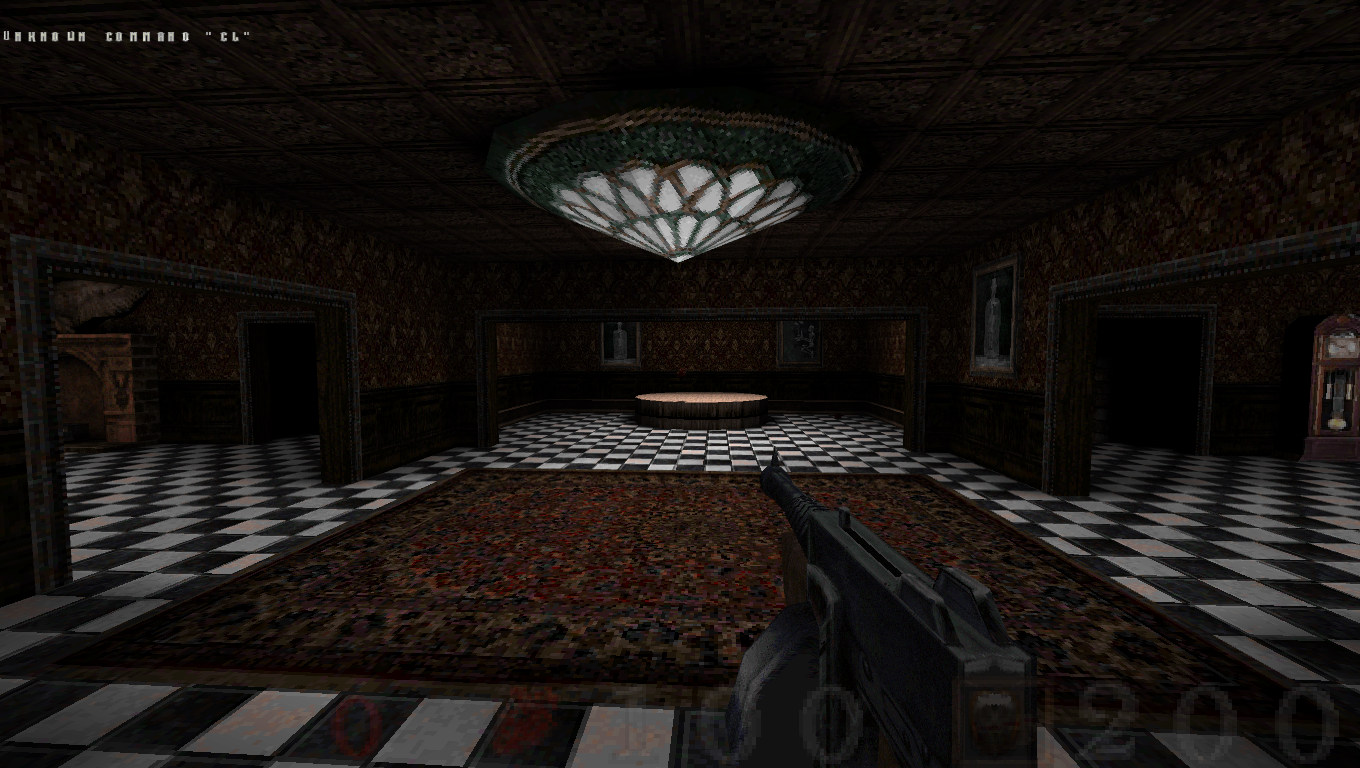
http://s33.postimg.org/91n9tf8kt/quakespasm_sdl2_2016_06_01_13_03_14_83.png http://s33.postimg.org/5pvwq9ve5/quakespasm_sdl2_2016_06_01_13_04_20_83.png http://s33.postimg.org/qpx58zk8d/quakespasm_sdl2_2016_06_01_13_03_31_97.png http://s33.postimg.org/o1h1qxgrx/quakespasm_sdl2_2016_06_01_13_04_07_22.png http://s33.postimg.org/rfna7c3sd/quakespasm_sdl2_2016_06_01_13_04_45_35.png http://s33.postimg.org/5tiu3wyst/quakespasm_sdl2_2016_06_01_13_04_33_45.png You use the floor textures as walls and ceilings rather freely, nothing particularly wrong with that, but it did make me think that this is another map like "the fly" from 1997 by Markus Klar.
For now, I'd say you should focus on texture alignment rather than choice, quite a few of little pesky errors in the metalwork from the last shot. Looks like a vertical and multi-level map so far, keep the Z-axis going! First map process, that is some pretty decent lighting and the textures are not too shabby either. It is a bit mish mashy with the textures so I would work on making things a bit more consistence. Looks like a pretty foreboding map!
Keep it going! Damn, it's been a while I passed through here, and I never posted before, but these screenshots are looking mighty fine. Makes me want to make a Quake map soon :P
Thanks for the tips y'all. I can see the misalignments otp was talking about it, and I've found more elsewhere in the map. As for the wall/ceiling textures, I kind of just stuck those on there based on the color palette I was going for without much regard to what they're normally used for in Quake. I had initially used a different wall texture (from ogro.wad) but decided it didn't look good in-game, plus some of those textures have nasty fullbrights. I'll have to experiment a bit with different wall textures.
My all time favorite Quake theme takes the floor and uses it as the wall and the ceiling as the floor, it's great. Limbo map from the first mispack, h2m5 or 6 I think.
So don't worry about it. Your skeleton textures seem out of place though. I'll think about it... honestly the textures just look like brick to me, I don't really register them as floors even after it's been pointed out.
|
| You must be logged in to post in this thread. |
| Website copyright © 2002-2024 John Fitzgibbons. All posts are copyright their respective authors. |