|
Playing on Darkplaces it is much more darker idk why. On Quakespasm it is much brighter for some reasons.
was just relativating.
:P There are many mods on what Quake can handle. They all have their own atraction. Telejanos - great metal light shine. QbizQuake - original dos quake on new engines. DarkPlaces is developped by LordHavoc I thought and one of the populairest stars for modding. The name relates to the dark and desolated places quake can be. By means of what you cannot see won't say it doesn't supposed to be there. There are a lot of ways to clear your view with the manual of the options. So your first dark insight might be, that you had the wrong view options. https://dl.dropboxusercontent.com/s/npdmdv3hlkbdyd7/pritchard1-alpha-1.zip
Built for AD 1.42 or whatever. Just throwing out the first 2 minutes of the map to see if i'm heading in a good direction or not. Some screenies: http://i.imgur.com/ax4hVg0.png Don't expect to reach that gun without cheating. http://i.imgur.com/ZZ2ppnl.png http://i.imgur.com/LbuW9I3.png Take the elevator into the dark texture to end the level. Small feedback from screenshot (I've not downloaded or played yet). It is a fair bit of work too, so take suggestion with a grain of salt.
Make 3 borders around the edges of the dirt on the tiles, make the outermost one 80% opaque, the innermost 20% and the middle one 50%. That way you'll have a nice gradient of dirt over the tiles that looks more "realistic". OR around the edges of the tiles use textures generated by: https://www.quaddicted.com/files/tools/quake_texture_tool_v0_1_0.zip Otherwise looks awesome! A noble idea, I suppose. Unfortunately I'm not sure how to get QTT to behave with my source textures :( one's 128x128 and the other's 64x64, and the result = total mush. Here's what I got out of it, scaled down to 50% size in-editor: http://i.imgur.com/fFU3WtE.png
Never mind that the dirt is facing the wrong way right now; there's so much lost detail in the floor tile texture it's just not possible to use. I hearby leave the task of figuring it out to whoever wants to make it into the credits for the map. Here's the source textures. That area is so small, why not just playing around with vertices? It must be the artistic choice to create opaque textures, slowly changing to an another texture.
Or sculpt the individual floor tiles and have them lie on top of the ground in the center (maybe 4 units high), and then some dirt heaps on the sides, slanted faces towards the outer walls.
give these a whirl, I made them in gimp
You might need to remove the fullbrights if the gimp derped and decided to use them when reducing the colours. https://dl.dropboxusercontent.com/u/108695968/pritchard.zip Meh, I just replaced the mdl with another one.
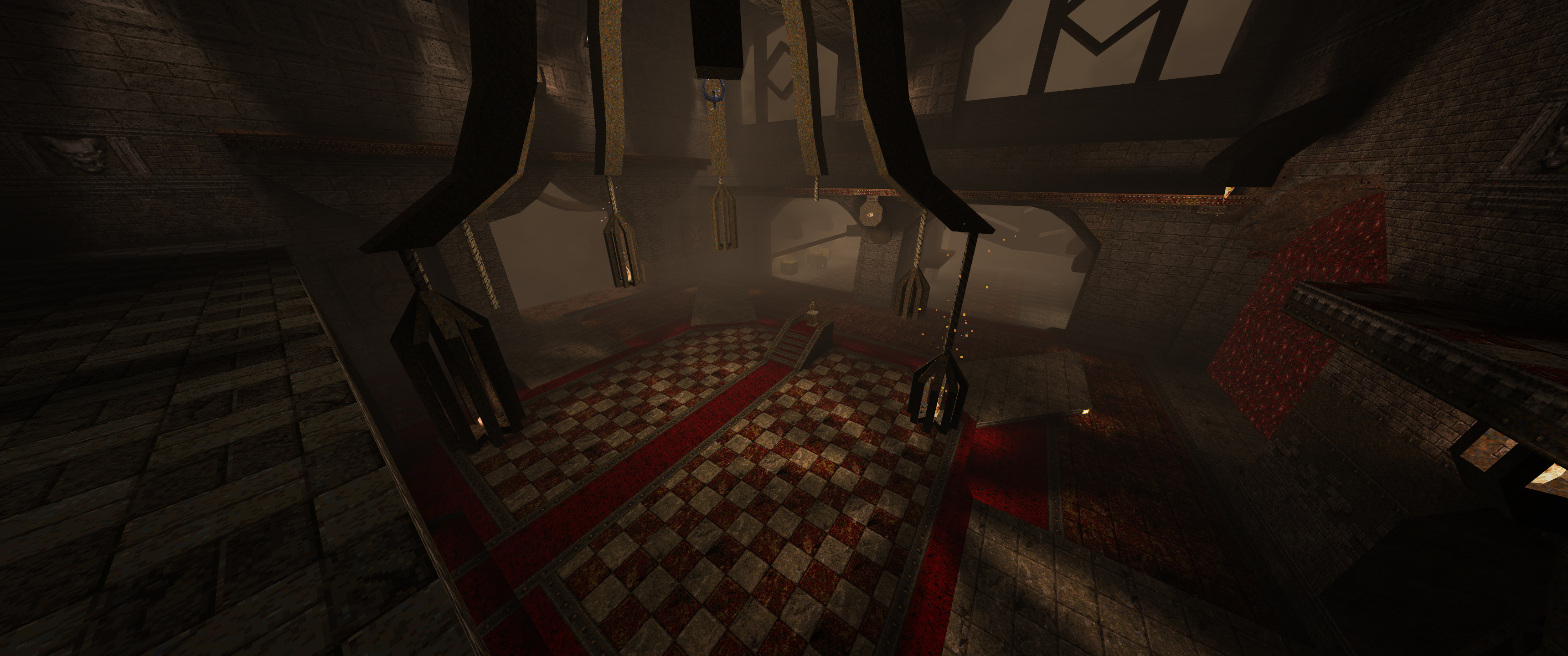
-Cool brushwork and rock/base infusion...you do very well with that. -Gameplay is fine, base enemies are fun to pulverize but a very linear trip...being that it is alpha I am sure that's intended. -Some rooms had too much fill lighting in my opinion. I want some more contrasting shadows...the first room being the largest offender. The last room however is the most impressive room I think. -I didn't care for the fiend trap, I rather be able to backpedal out the door since that is my first reaction...I almost am guaranteed to get leaped upon. Again, just my personal thoughts. Keep it going, a really unique style being created here and I would say you have brushwork down quite well! I knew I was going to forget something. The field.MDL is from a post on Preach's blog iirc. It's not a big deal but I'll have to remember to include it in the future...
Thanks for the feedback on brushwork, I'm glad you think I'm heading in the right direction. I do need to work on the lighting in some areas like you said, I struggled at the start with deciding how I wanted to have the map look. I'm conscious of having the level be too dark to play properly in, especially. That was my biggest concern for the final room, actually. The level is quite linear, I'd like to open it up a bit and I have some ideas for how that could work on the future. I'm intending on using a bit of backtracking, I think it'd work well to have the player use some of those areas in reverse. But aside from that I want to have some more blocked off doors like the one at the start, and have the player work their way through segments of the level again rather than just having them turn around and head back or anything like that. The fiend trap is a tough one. Second try it's very easy, first try i can see it being a really painful experience. I suppose leaving the back door open could work to help that, but that undermines the experience of having a fight with a fiend in such an enclosed space... Maybe I'll just replace it with a dog on easy and normal :P http://i.imgur.com/ZnRqTQ7.png Thanks Shamblernaut, they were a bit of a pain to put down since I had to cut up the floor quite a bit but the end result is quite nice.
They're definitely my favourite textures to use for this sort of theme. They're pretty versatile, and they're a lot better for building darker, grimier areas than normal base textures are.
I love that set. There's a really nice set just released that could be adapted into the set with a bit of tweaking -
http://forum.zdoom.org/viewtopic.php?f=37&t=54248 I've been working on a very similar set for Doom 64, but, sadly, I've abandoned it.
That tekwall is pretty sick, but I wish it would tile. In honor of AD 1.5, here is another progress shot from my upcoming map. I am going to incorporate some of the new toys from the patch so that will be fun.
http://www.quaketastic.com/files/screen_shots/mjb_cages.jpg
|
| You must be logged in to post in this thread. |
| Website copyright © 2002-2024 John Fitzgibbons. All posts are copyright their respective authors. |