|
Also, what I actually wanted to write instead of the parenthesis was "Quakespasm screenshot for reference", to tell which engine was the hardware-accelerated screenshot from, but Twitter's 140 character limit wouldn't allow. It wasn't my intention to sound unkind or to be unfair.
By the way, IIRC I've put all replacement models into a pak11.pak file, but most engines won't load non-sequential The map isn't exactly the same either, the one in the Retroquad screenshots was recompiled with lit water. That's also why the shadow in the ceiling above the stairs is smoother. is it different than quakespasm/MarkV's "contrast" cvar? (I'm not sure how it's implemented in MarkV, but in Quakespasm contrast is just a multiplier applied to the framebuffer; every R/G/B value is multiplied by the value of "contrast", has gamma applied to it, then is clamped at 255. Pretty sure the output is the same as MarkV.) I'm guessing from the "pal_" cvar name, you're manipulating the palette.
I think features like this are great for playing on laptops / under non-ideal lighting. Turning up "gamma" very far just results in a grey washed out mess. a bit plain, sparse etc but I like the general vibe. Would recommend being careful with the coloured lighting.
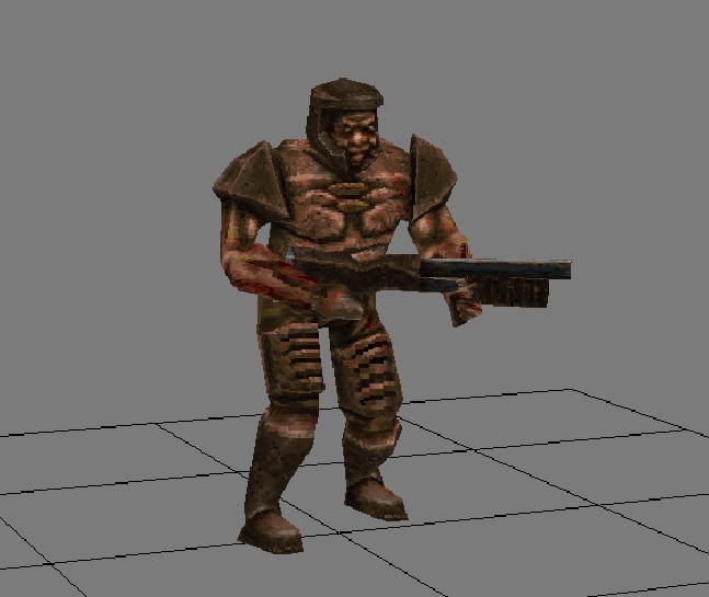
Please check out my new grunt model:
http://www.quaketastic.com/files/models/grunt3.jpg You can download him here: http://www.quaketastic.com/files/models/grunt.zip Please give feedback and thanks. especially like the more gaunt look with the skinnier arms - like he's shrunk as he became zombified and now the armour is too big for him.
I think it's cool that you're working on redoing some Quake models. Would be interesting to see some unique creations rather than recreations.
Liking the emaciated looking grunt model! Also, actually seeing the corrupted soldier wear a measly shotgun instead of the futuristic looking rifle of the vanilla model really adds to the picture of the soldier having become more or less a brain-dead zombie.
I'm really enjoying doing the Quake remodeling right now, and it's helping me brush up on 3D art. I do have a whole list of original monster ideas that I plan to get to once this project is finished.
Found an elephantalk monster.
What order does a quake monster have to be?
That was the question that came up to me. Keeping in mind quake monsters are rather gaga and comick-like they do tend to a darker behaviour like creeping freaks. My personal feeling is there could be any kind of creatures, at least as it is low poly, has a hazard potential danger, and does not meet the reasonable forms of civilized beings. At least that's my opinion. No problem with Bender, MrBig, or JackJazz. It's just a temperary study in func_cloth function. Animation of secundary movements like swing & balance are rather hard and time consuming to attach by hand. A "cloth_attach" is a computed weight counter, that gives the model its gravity forces. That way the tentacles move in a natural state, without adding all perticular states by hand. So I took an OldOne look alike, turned it upside down and started to give it some random movements. When finished it looks like an elelphant snail. It has aptitude for music, moves like a starfish, like to puzzle cryptograms, and gives explanations for its behaviour. widow model and lighting test
concept art after a recent string of failures I decided to revisit my fist enemy design... and it turned out pretty good! I really like the classic ghastly look, very creepy. her speed and evasive maneuvers should make for a tense fight. I'll probably regret giving her articulated hair (6 segments per hair leaf!) but it should look pretty sweet. learned a lot about blender and modeling in general with this one: alpha channels (hair, teeth), multiple texture layers (super flexible!), vertex groups, masking, etc. lots of valuable knowledge here that will be very useful going forward (and repainting the previous models). @chillo - looks good :D @madfox - did you make that or is it from something else? my inner japanese school girl is frightened. wish I could take credit for the RL. it's from DN3D and being used as a placeholder.
Hi there,
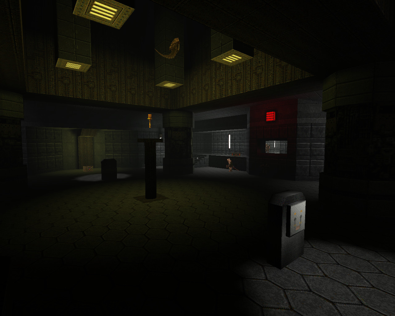
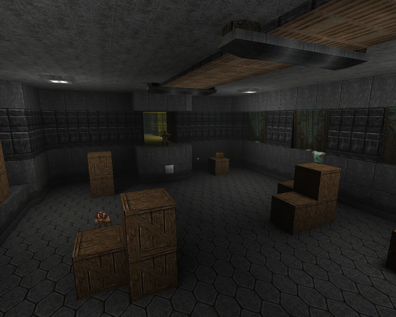
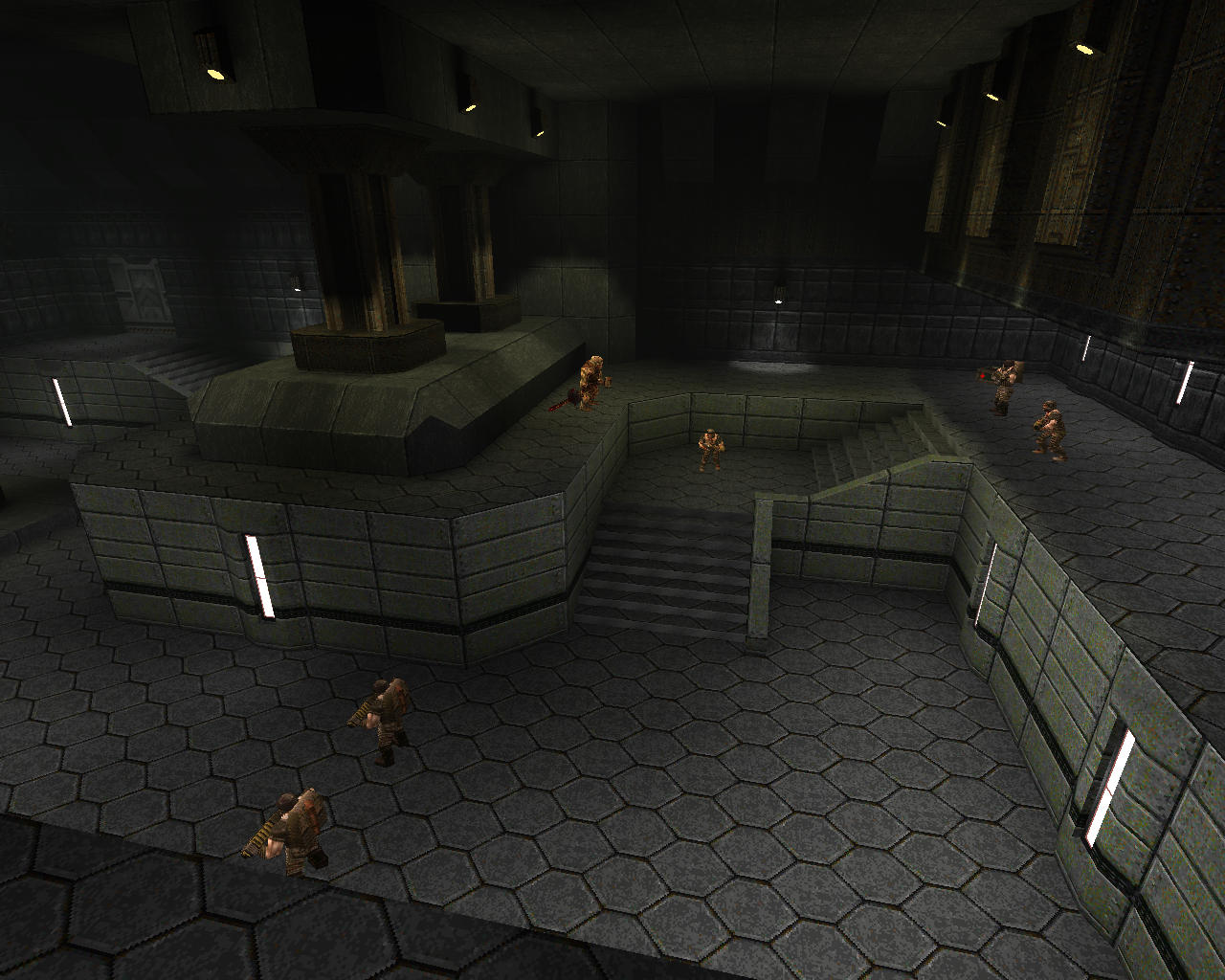
I took the liberty of updating the beta for The Dreaded Dreadbase of Dread. - fewer crates, trying to compensate with more interesting architecture - tweaked enemy placement - more sophisticated secrets Screens: http://maikmerten.de/base1/base1-1.jpg http://maikmerten.de/base1/base1-2.jpg http://maikmerten.de/base1/base1-3.jpg http://maikmerten.de/base1/base1-4.jpg Download: http://maikmerten.de/base1/base1.zip There still are some areas I'm not happy with regarding how sparse they are, but I think this should be a nice update regarding the previous beta. If someone finds time to record some demos, that'd be awesome! Just noclipped through briefly, and there are some definite improvements. The brushwork is much more interesting visually. The staircases look a lot better, and it's particularly good how you've broken up some of the large grey swathes with tech details and/or rusty browns, and some more detailed brushwork, e.g. in the first room. The map can use more of that: there is still a lot of monotone grey, and those grey textures really only come into their own when thrown into contrast with e.g. brown/techy textures.
The boiler-like rusty structure you added in the second room is also very nice, not only for the above reasons, but also because it immediately makes the place seem more real and less like a game level, by hinting at mechanical processes going on in the background and a function that the place may have, other than simply being a space for the player to traverse. Plus, by adding chunky structures into otherwise wide open spaces, you're immediately making the gameplay more dynamic, by giving the player ways to break line of sight (which is invaluable in a map with many hitscan enemies like grunts, in my opinion) and opening up ways of engaging with monsters. I'd say the map could use a lot more of that as well, as the spaces are still very, well, spacious. It's good that you reduced the number of crates, and the remaining crates often fulfil the above gameplay purpose (breaking up large spaces) -- but they still don't look that good in my opinion. I don't think the crate texture and the square brushwork are interesting enough to be used as such a prominent element. The map would be improved if you replaced more of the crates with architecture -- e.g. mechanical structures or pillars instead of a row of neatly stacked crates in the middle of a room. You could then still plonk in a couple of crates here and there for extra visual detail/extra diversification of space afterwards. I saw what I assume to be new secret areas; those look enticing. At some point I need to play through the map properly and find them. :) TLDR: Very nice changes, but I'd say take it even further. Also: it's interesting to see your progress. It looks like you're just replacing the download and the screenshots as you update. I tried to go back to the earlier screenshots you posted for a side by side comparison, but they turned out to have been replaced by shots of the updated map. This is kind of a pity; it would be great if you could rename the updates something else, e.g. base1v2/v3/etc. or something. Just my 2 cents. :) @spy, thanks for your willingness to give the map a try!
@former_total_newbie Thanks for you quick look - I agree that there's more to be done. I often find that it takes quite a while and much experimentation to come up with interesting brush shapes - I guess I'll need a few more iterations until the boxy feel of some locations is fixed. Yeah, I was foolish enough to not keep old screenshots around. So, I created new screenshots of beta1 and beta2 in areas with significant changes: http://maikmerten.de/base1/comparisons/ here's the skill3 demo
https://drive.google.com/file/d/15aJN8FdTEkbEBEqv-nbIQKiSNKN3zkTx/view?usp=sharing i liked a lighting very much, the gameplay itself was around the id maps
|
| You must be logged in to post in this thread. |
| Website copyright © 2002-2024 John Fitzgibbons. All posts are copyright their respective authors. |