|
Just noclipped through briefly, and there are some definite improvements. The brushwork is much more interesting visually. The staircases look a lot better, and it's particularly good how you've broken up some of the large grey swathes with tech details and/or rusty browns, and some more detailed brushwork, e.g. in the first room. The map can use more of that: there is still a lot of monotone grey, and those grey textures really only come into their own when thrown into contrast with e.g. brown/techy textures.
The boiler-like rusty structure you added in the second room is also very nice, not only for the above reasons, but also because it immediately makes the place seem more real and less like a game level, by hinting at mechanical processes going on in the background and a function that the place may have, other than simply being a space for the player to traverse. Plus, by adding chunky structures into otherwise wide open spaces, you're immediately making the gameplay more dynamic, by giving the player ways to break line of sight (which is invaluable in a map with many hitscan enemies like grunts, in my opinion) and opening up ways of engaging with monsters. I'd say the map could use a lot more of that as well, as the spaces are still very, well, spacious. It's good that you reduced the number of crates, and the remaining crates often fulfil the above gameplay purpose (breaking up large spaces) -- but they still don't look that good in my opinion. I don't think the crate texture and the square brushwork are interesting enough to be used as such a prominent element. The map would be improved if you replaced more of the crates with architecture -- e.g. mechanical structures or pillars instead of a row of neatly stacked crates in the middle of a room. You could then still plonk in a couple of crates here and there for extra visual detail/extra diversification of space afterwards. I saw what I assume to be new secret areas; those look enticing. At some point I need to play through the map properly and find them. :) TLDR: Very nice changes, but I'd say take it even further. Also: it's interesting to see your progress. It looks like you're just replacing the download and the screenshots as you update. I tried to go back to the earlier screenshots you posted for a side by side comparison, but they turned out to have been replaced by shots of the updated map. This is kind of a pity; it would be great if you could rename the updates something else, e.g. base1v2/v3/etc. or something. Just my 2 cents. :) @spy, thanks for your willingness to give the map a try!
@former_total_newbie Thanks for you quick look - I agree that there's more to be done. I often find that it takes quite a while and much experimentation to come up with interesting brush shapes - I guess I'll need a few more iterations until the boxy feel of some locations is fixed. Yeah, I was foolish enough to not keep old screenshots around. So, I created new screenshots of beta1 and beta2 in areas with significant changes: http://maikmerten.de/base1/comparisons/ here's the skill3 demo
https://drive.google.com/file/d/15aJN8FdTEkbEBEqv-nbIQKiSNKN3zkTx/view?usp=sharing i liked a lighting very much, the gameplay itself was around the id maps Wow, your demo is very useful! You're certainly playing quite differently from how I approach things (great jumping skills!) and I now see that some encounters don't always work out as intended.
For instance, it never occurred to me that one can simply cheese out of the Shambler fight by leaving the arena, I always go in guns blazing. But then again I don't play on skill 3 ;-) Also never noticed that the Shalrath doesn't trigger when staying in the elevator. Seems the secrets are too obscore. They are marked visually and/or via geometry, but it appears it's too easy to miss them. I wonder why you seem to dislike the lighting gun. Does it make things too easy? Thanks four your kind remarks regarding the lighting. I spend quite some effort on tweaking lighting to my liking, and your comments enforce my impression that lighting is, indeed, very important. I'm a bit of a drrunkkk, to explain some thing prroperly, sorry
speaking of a secrets - i'm failed its plain and simple about the shaft, it seems i have missed the super nailgun, but i'm strongly believing there ain't no need for a lighting fgun(Sorry for my broken engleesh) overall , it is a great map to starting on (Sorry for my broken engleesh2) sparsity not always a bad thing. some good little touches here and there.
Reccomendations>>> maybe non wood crate texture? JF2 texture pack or whatever by Metl has some nice basey ones that might fit well. That one for the oblivion mod? Someone please clarify if you could re shot 3 having some trim around the holes through which the big columns recede would be a bit more visually pleasing. one other way to break up monotony, eg in shot 4, might be some recessed computers or vents in between the panels. Again could mine the aforementioned wad, or even rubicon2 for some that might work there. can't comment as to gameplay, sorry! View here:
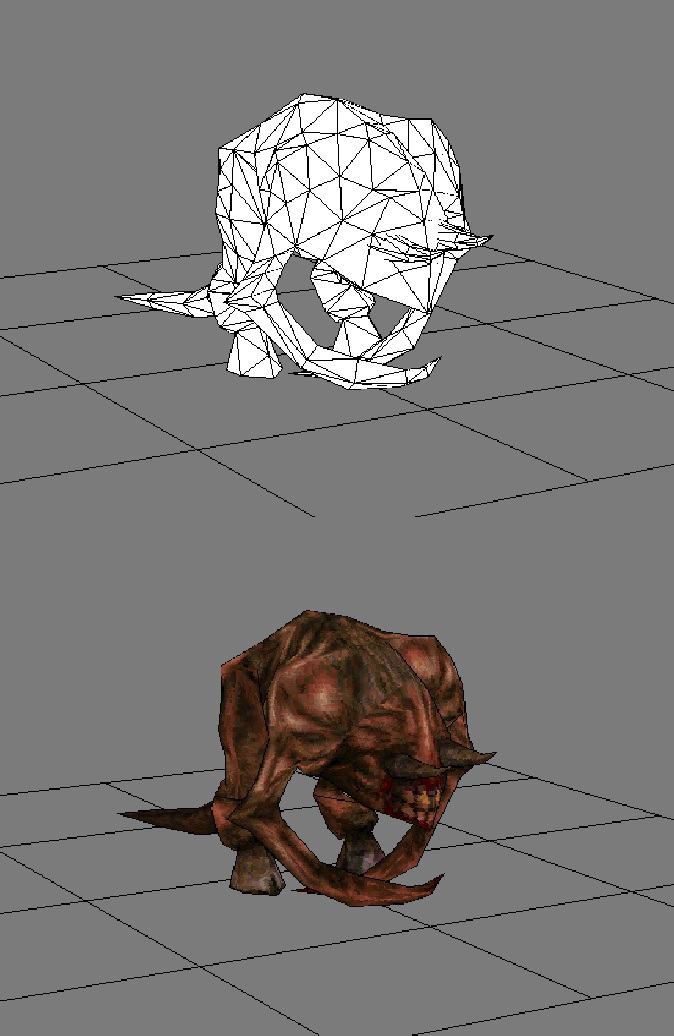
http://www.quaketastic.com/files/screen_shots/demon123.jpg Download here: http://www.quaketastic.com/files/models/demon.zip Please give feedback! Thanks. Personally I don't think a fiend would be so gaunt, specifically around the biceps. They need to look as though they're capable of smashing through armour with a single eviscerating blow.
its "bicep" could be bigger, but overall looks great. Also what about adding some blood to the ends of its claws?
Need blood.
Then again it would explain why the poor feller is starving. Ya beef up the biceps a bit, and feed the poor guy and he'll be grand. I love fiends! Looks neat. The more gaunt appearance works for me, because it seems like the fiend hasn't eaten in a while, which in my mind makes it more wretched/dangerous.
I don't think I like it as a fiend replacement, but it has the beginnings of an interesting monster -- maybe an additional variety on the fiend? The thinner claws make it look a little like a bird carcass or a Half-Life headcrab in-game, which is unsettling (in a good way). If it had a faster clawing animation than the fiend, I could see it becoming a nicely terrifying monster.
The whitish hooves look fine in the editor shot, but in-game it looks like the fiend is wearing white running shoes. The open mouth during the attack animation also doesn't work for me aesthetically. I can adjust the biceps, maybe adjust the coloring on the hooves. Adding blood will probably help as well.
I'll also see if I can adjust the mouth during the attack animations. Make it more subtle. Thanks for the feedback, everyone! I can adjust the biceps, maybe adjust the on the hooves. Adding blood will probably help as well.
I'll also see if I can adjust the mouth during the attwck animations. Make it more subtle. Thanks for the feedback, everyone! Never understood the eyes vs no eyes Fiend argument myself. At least the Shambler's fuzziness is questionable enough to be worth arguing about (including two opposing official stances, A. Carmack saying it's flesh and Romero saying it's a shaggy yeti coat), but this isn't 1973, it's easy enough to open up the pak files and look at the Fiend's texture and gaze into its piercing yellow eyes. Yes, there's an extra bit at the top that, if applied, removes the eyes, but it's unused in-game (as everyone should damn well know because we're not barbarians playing with texture filtering enabled making the eyes impossible to distinguish anyway, right?).
Fiends have eyes
Vores are called vores Spawns are called spawns Scrags are called scrags, have eyes, and are fleshy. Dude, why not adding a spiky cock under your fiend model? That kind of long and thin spike that kills a butt!
Again, I think I like the concept art more than the model. The texture is very clean/flat and I think the enemy design is kind of homogeneous so far. It's good to keep in mind the silhouettes when designing a character
http://www.chimpsahoy.com/wp/wp-content/uploads/images/2011/01/silhouettes.jpg Plus I think more colour variation would help make the different enemies stand out even more. :)
|
| You must be logged in to post in this thread. |
| Website copyright © 2002-2025 John Fitzgibbons. All posts are copyright their respective authors. |