|
so regarding mh's BengtLightColoured - do I have any reason to switch to using it over bengt's original if I'm not implementing coloured light?
Using coloured lighting in Quake is a bit like trying to "improve" a Piranesi etching with a box of Crayola. oops, yes, i forgot to mention, there's also multithreading, so even if you're not using the coloured lighting, it's still way faster.
and i wouldn't discount coloured lighting entirely. i certainly don't advocate neon greens and blues, but subtle shifts can really add a lot to an area. even just tinting outdoor sun minlight slightly blue can make shadows look deeper and more natural. Ah cool, I'll have a look at the threading shizzle :}
Regarding coloured lights - I only use WinQuake so won't ever see them. These fancy GL-based engines do horrible things to the look of Quake's textures and lightmaps. Texture filtering in Quake is about as appropriate as a J-Pop soundtrack in a Fritz Lang noir. Jesus >_<. Fitzquake + gl_texturemode 3 ftw
Or if you're adventurous, there's the Qbism engine which is a high-limit software port with support for colored lighting as stuff. Btw. running BJP's light with the -gate 1 speeds it up considerably without visible downsides. Not sure if the multithreading light has that too (would make it a one second job, I assume). I tried gl_texturemode 3 with GL-based engines but you still don't get that crucial striated effect with the lighting, and besides, circular particles are just wrong.
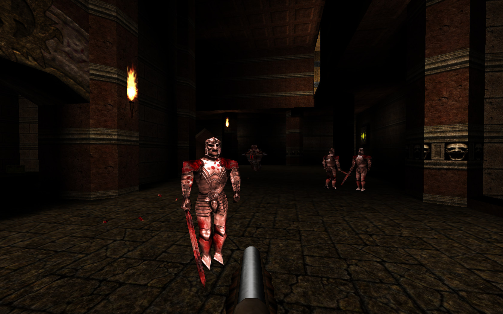
It's a bit like getting Optimus Prime for christmas only to discover you've been bought the Chinese knockoff version instead. Qbism looks less offensive than most engines I agree. Pol Pot was also less evil than Hitler. I've always used -gate 1 btw... But with a custom engine you could use high-res skins like this http://www.securitronlinux.com/files/dp000012.jpg
But with a custom engine you could use high-res skins like this
But why would I want to see a knight in that much detail? Would H.P. Lovecraft's stories have been improved if he presented his horrors in such mundane and precise detail? First, you think colored light is fine, then you'd want truecolor textures...
this way you'll end up with q2 monsters allover your maps! And the last thing you know you are not allowed on quaddicted anymore. Rock on, Kinn. You're a man after my own heart. :) Blocky pixels and low res texture FOREVER.
That high res knight, to me, looks ridiculous. but it can now stab you with its nose!
didn't everyone get the memo on "higher resolution being always better"? Rock on, Kinn. You're a man after my own heart. :) Blocky pixels and low res texture FOREVER.
/hugs Willem. And I bet he looks real menacing when the 8-bit vertex precision is causing his face to swim around on his cube head like a swirl of cr�me fra�che on a bowl of carrot soup. I truly believe, in the most honest and genuine way, that Quake in its untainted, software rendered form has a timeless quality to its visuals that is only degraded by the addition of polygons or additional colours or texture effects or whatever. All of the visual elements perfectly balance and complement each other in terms of style, level of detail, palette etc. etc. Any changes to one or more throws the balance out of whack and the overall effect is only one of dissonance. Unless you literally redo every aspect of Quake's visuals so that you achieve a new overall unification, you're always going to end up with something that looks like one of those cheap shovelware games from ten years ago or something. causing his face to swim around on his cube head like a swirl of cr�me fra�che on a bowl of carrot soup.
seriously, are these just coming to you? hehehe :D but it can now stab you with its exaggerated junk!
Heh, reminds me of this "alternative" hellknight skin I once did but wisely decided not to inflict upon the world. Check out those buns. Feel free to use it if you're so inclined: http://dl.dropbox.com/u/61424391/Temp/campness.bmp What's your painting method?
Despite his arse hanging out and him looking like an extra from the sexually ambiguous 300 it's well done :)
|
| You must be logged in to post in this thread. |
| Website copyright © 2002-2024 John Fitzgibbons. All posts are copyright their respective authors. |