|
This is a map I'm making for my new mod, it's metal themed, with several different areas
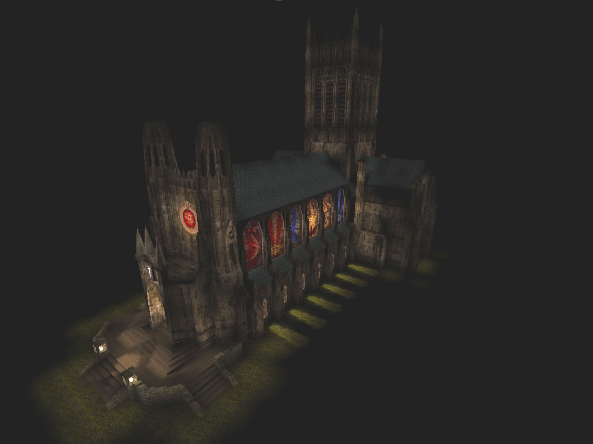
that contrast with each other. Worshiping hall http://ompldr.org/vOTdjNg/alpha1.png Transition http://ompldr.org/vOTdjNw/alpha2.png Other side of the transition http://ompldr.org/vOTdjOA/alpha3.png Transition room from another angle http://ompldr.org/vOTdjOQ/alpha4.png Tunnel before transition room, looking into the Worshiping hall ;) http://ompldr.org/vOTdjYQ/alpha5.png jt: Nice editor. :P
Madfox: Interesting shots in your booth. Seems to need proper trim on several transitions and ledges. Why do you always mirror that metal skull texture? Talking about the diverse texture set in Duke tempted me to post these two shots from another project of mine slowly being worked on.
http://img.photobucket.com/albums/v220/deathquakis/qmapthing01.jpg http://img.photobucket.com/albums/v220/deathquakis/qmapthing02.jpg looks sweet dude! make sure you post that when you're done. i really liked your other d3d map.
also, is that a space ship? would explain the monochrome textures. i love space ship maps... probably cause one of the first q1sps was that hell in a can map. i loved the concept of that map. dunno if it's too late to nudge you in that direction a bit. ;) i just like the slice of life concept of being on a space ship in the middle of nowhere and having to fix problems (like aliens breaking out of containment!) @DaZ - Plan to in other sections like the cafeteria/recreation sections of the map. Keeping the white scheme here mostly for the medical section and areas close to it.
@necros - Actually, it is a space map, nice to see you picked up on that. I don't really have much direction at the moment so anything that can nudge ideas is good, I'll probably check out that map asap. Thinking about it, anything like System Shock 2 / RTC 3057 (ZDoom) would be an interesting direction. hell in a can: http://www.quaddicted.com/reviews/casspq1.html
also, have you played that neil manke hl1 map 'uss dark star'? http://planethalflife.gamespy.com/View.php?view=HLMaps.Detail&id=961 @neg!ke - thanks for comment. I have the retexture pack in my iD directory but for some reason all textures are upside down.
I turned some in the directory but it didn't help. So it isn't something I do on purpose. btw, the level took 15 houres extra vising and had teo giant hom's. Why do they only show at the end? i've noticed this happening sometimes with texmex when importing/exporting textures to targa. not sure why it does that. annoying though.
It's a shame Neil Manke's full game version of They Hunger was never finished. Supposed to be released years ago on the source engine but apparently Neil fell ill and wasn't able to finish it. He was a friggin mapping machine that guy.
They should just get a new mapper to take over. Shit I would have finished it if this was 10 years ago. some targas are stored in "upside down" format (bottom rows of pixels first, top rows last) and there is a flag in the header that indicates this, so perhaps texmex doesn't pay attention to that flag.
(Fitzquake had a similar problem with upside-down TGAs, long ago, before i fixed it.) I'm using Fitzquake080, but if I turn all tga files in the directory, in game they are still upside down.
didn't know you tweaked that image and yeah, playing it, it's quite dark.
also, it's a lot less cool as an actual map. :( way too small for a quake map. it looks like it was meant to be built to scale. so in that regard, it succeeds, but too cramped for an actual map. you could totally blow that up 2x and you'd have enough room to move around. i could really see a map being built with the same basic layout only with locked doors for each successive floor connected to the spiral stairs. and maybe lighter textures like q3gothic block10 or something. Been working on this slowly over the last month or so, would appreciate some feedback!
http://www.dropbox.com/gallery/33279452/1/l4d2map?h=6767ef It's a night time map with a rainstorm that occasionally storms like in the valve hard rain campaign. trying to find a nice balance between darkness and the rain fog effect, how doe's it look so far? Looks good to me, though I'm not sure where it actually takes place. Looks like near a pier/docks under a giant bridge. Other than that it feels like generic trashy urban sprawl.
I would love to help playtest it if you need some testers. Other than that it looks good. Is it in a favela or hooverville? :p
The idea is for it to be in a construction site / industrial park just outside a city, maybe it doe's look a tad generic currently, something to work on!
It probably needs some set piece monument to define the look which it's lacking at the moment, the "bridge" you can see in some of the shots is actually a large in-construction "industrial thing" but it's not really finished yet, I'm actually sure what it meant to be I just wanted something looming overhead :) Thanks for the feedback, got some things to work harder on now :) looks cool! but maybe a bit.. drab? could you add some more colour to it, maybe some orange via rusted metal and such?
ironically, i find the vibrant blue light in the last shot a bit too cyan. :P wish i had l4d to run around in this. :)
|
| You must be logged in to post in this thread. |
| Website copyright © 2002-2026 John Fitzgibbons. All posts are copyright their respective authors. |