|
Links 3-5 require logging in or sign up.
This project from the usual saran wrap covered in goo effects which is a shame as they surely have a lot of texturing talent. Aw hell. I was logged in at QuakeOne and I even tested it but wasn't thinking to log-out. Me -1.
Attempt #2: 3. http://quakeone.com/~images/news/reforged2.jpg 4. http://quakeone.com/~images/news/reforged3.jpg 5. http://quakeone.com/~images/news/reforged3.jpg scrag's not bad. i mean, it's not really what i would have imagined it, but it's good work.
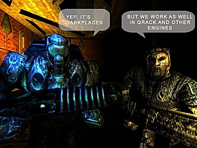
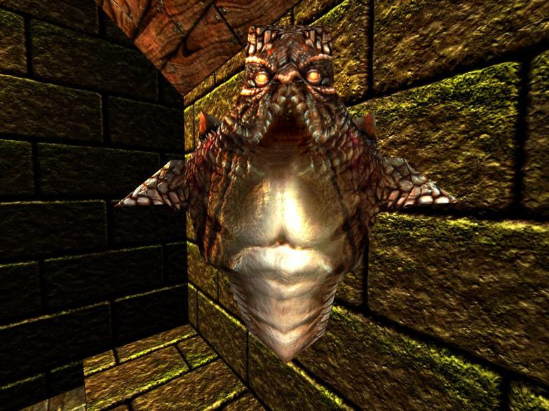
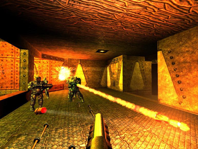
sadly, these high res textures just underline how much texture misalignment the original id maps had. :S Everything looks wet and/or coated in vaseline. I appreciate the effort but the specular and/or normal maps are cranked way too high.
I'm just spreading the information of the massive amount work these two have done over several months.
I occasionally read the thread and look at the screen shots. Beyond that, I have no special knowledge of the project except it is refreshing to see that kind of effort being invested in a Quake project. [In the last 6-12 months, a rather high level of texturing/skinning work has cropped at QuakeOne.com by various members. Fragger for instance. And zyxlx. And few others too.] There is something not right about those textures and skins. Everything is either too shiny or has over the top shadows. Some of the textures have been done really well but a lot of them in the screenshots have extremely heavy black lines. Also what is up with the death knight, he has some strange stain down the front of him.
Sadly most of the screenshots at Quake1 are locked unless you register (probably not a good idea because no one outside the community can see what is going on). The screenshots on the mod site are nice but again far too shiny. Maybe it is a default setting with dark places engine? maybe there is something wrong with the specular maps, not sure but they should fix it. I can see an incredible amount of personal time and effort has gone into this project but they seriously need to get a wider audience critiquing their work, otherwise it will not get any better. I must say I prefer the approach that Starbuck took with the base textures. Just make them look like the originals, but better quality.
they do have a lot of talent and the website is pretty flashy and theme-appropriate. I agree in general that the in-game rendering is where things seem to go bad. Some theories:
1. impossible to create normal/specular maps that actually look good in a quake engine? No, tenebrae looks pretty good, at least in some shots. Maybe the problem is everyone uses really intense specular maps? 2. quake 3. darkplaces/etc. lighting just can't look that great, and it's maybe because the doom3 lighting model is fundamentally bad for aesthetics (i.e. too stark, too many pitch-black areas, no illusion of diffuse light) 4. the maps they pose these models are badly lit, and results in ugly lighting on models.
|
| You must be logged in to post in this thread. |
| Website copyright © 2002-2024 John Fitzgibbons. All posts are copyright their respective authors. |