|
I think in Australia we say "Baby's bottom" which is like half way between the two on the creepy/gross scale.
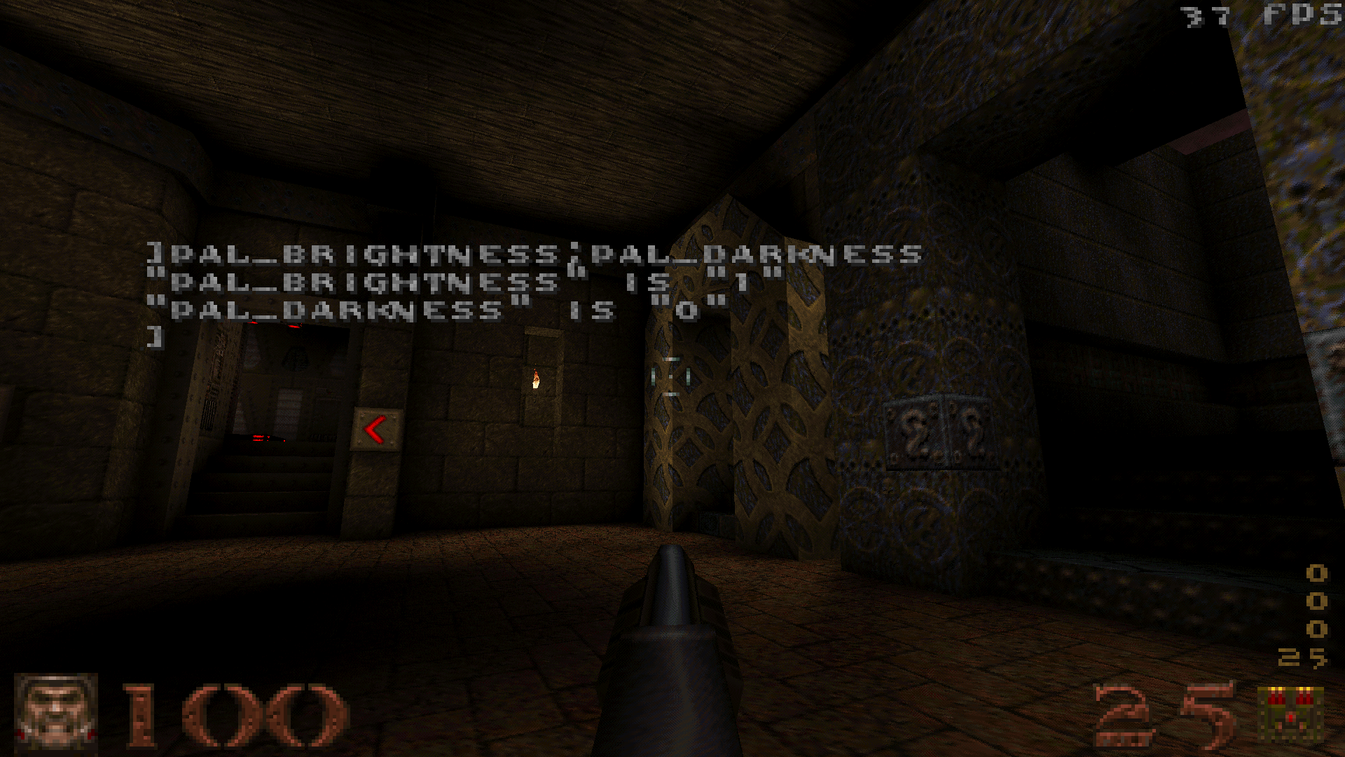
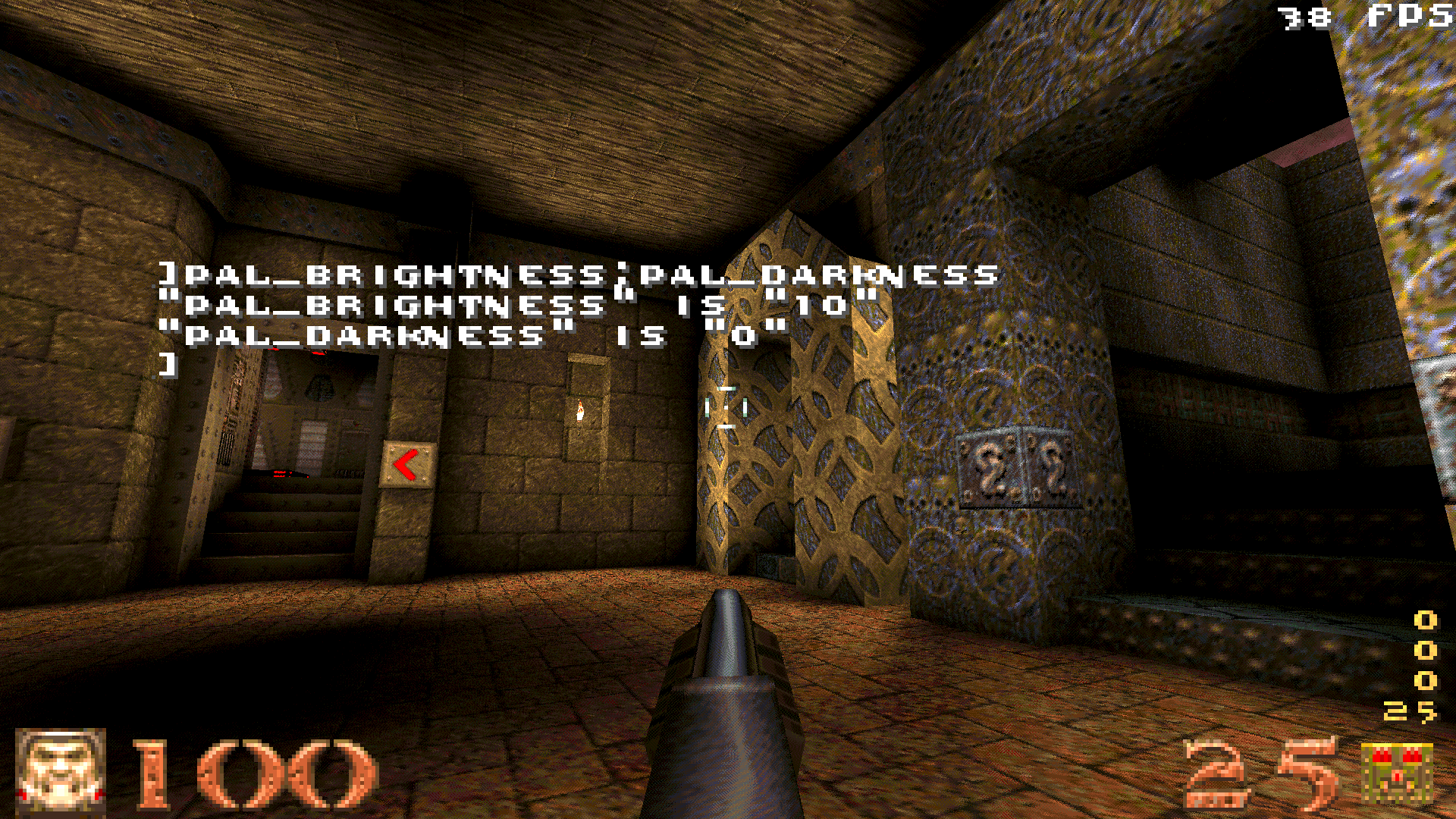
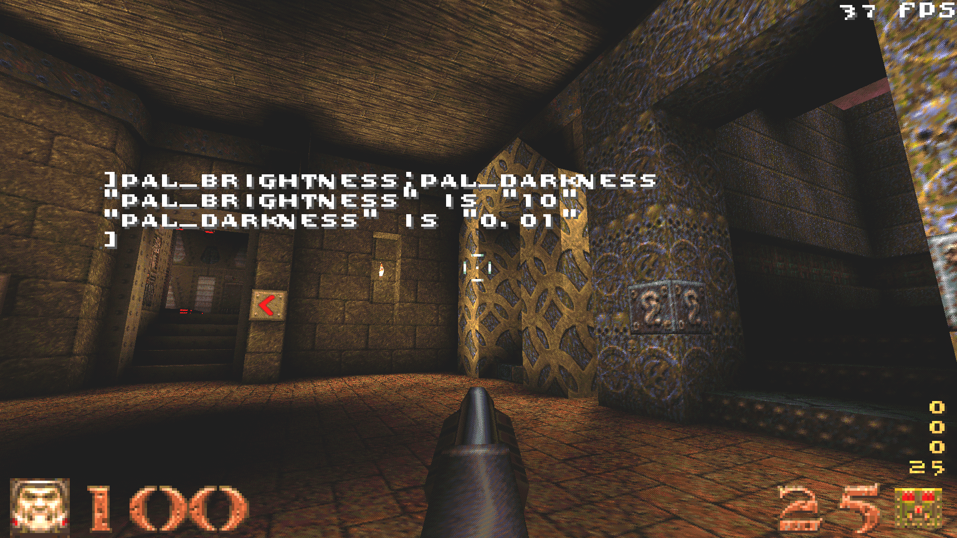
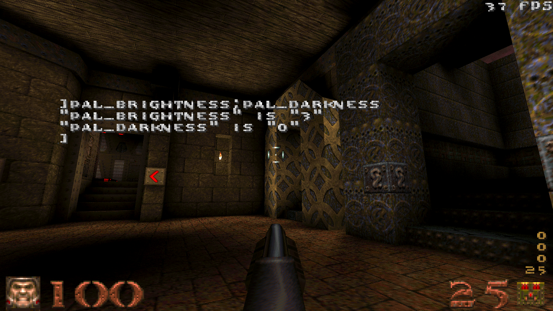
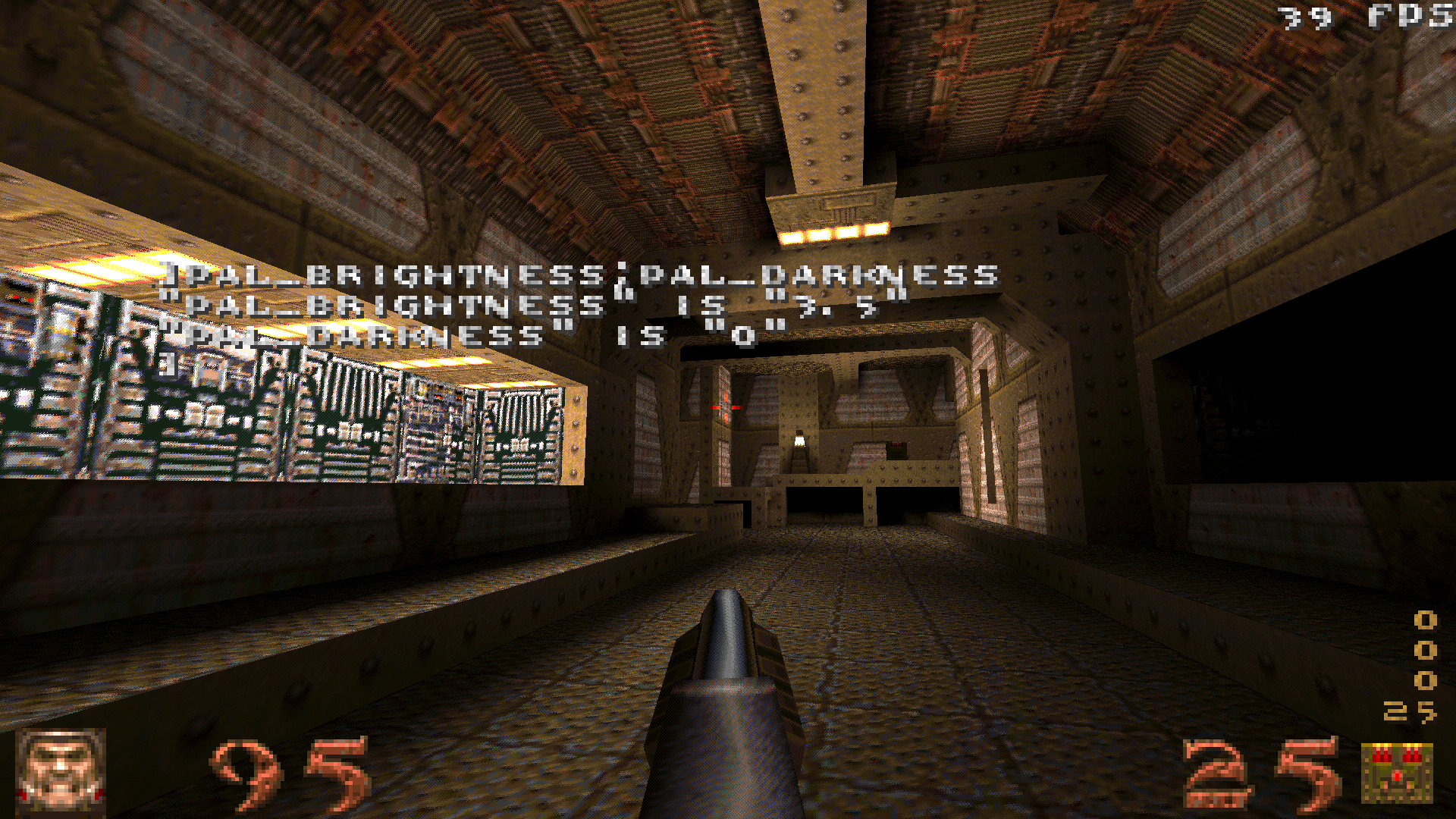
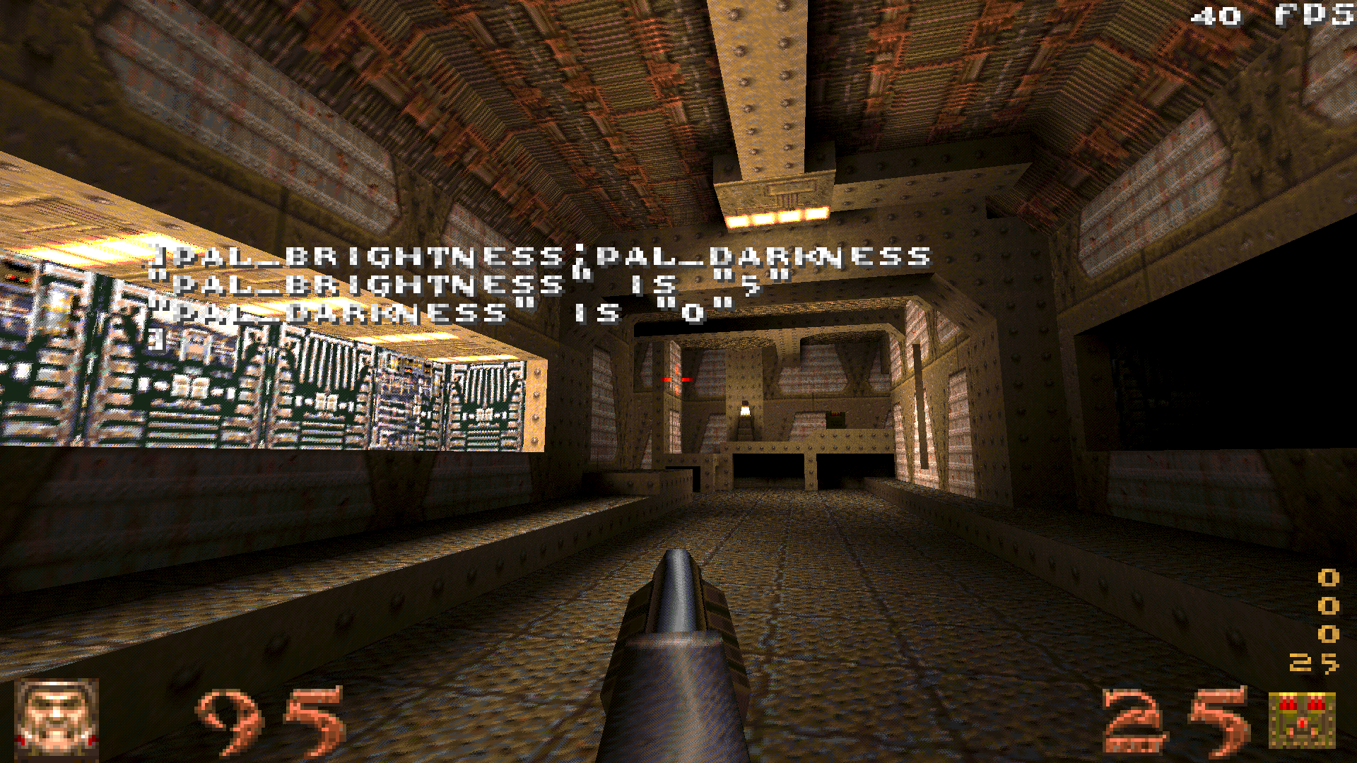
I really dislike how vanilla WinQuake's "gamma" cvar makes the colors washed out, so I'm working on a new system using two cvars: pal_darkness to define the minimum brightness, and pal_brightness to define the maximum brightness; the resulting value is normalized between them.
Default settings (same as gamma 1). Maximum brightness scaled up. Minimum brightness also scaled up. Now, a question: Does the resulting image looks fine for everyone here in this personal settings test? Afterwards I've reduced pal_brightness a bit, to 2.5, but I don't know if this is still too dark for most people. Anyway, one of my goals with this is to improve the image quality for YouTube videos, since YouTube compression is bad for dark colors, and WinQuake's brightness control makes the colors too washed out. I think 5 might look good. Doesn't QuakeSpasm allow you to set brightness and contrast in the options menu? I have my contrast turned up a bit, it seems to boost brightness a little as well.
Also, how'd you move your HUD to the corners like that? Looking at your personal settings test on my phone in a dark room, it looks good. Dunno if it's enough for YT vids though. And yeah, the new contrast feature in QS is very useful to have a brighter and more vivid image without washing it out.
Hmm. I've tried increasing the brightness, but this time in another map:
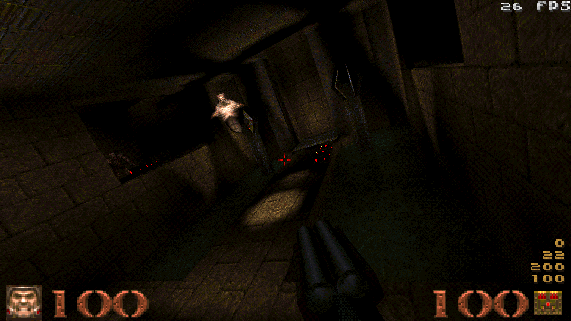
E1M1, default brightness E1M1, pal_brightness 3.5 E1M1, pal_brightness 5 5 seems to distort some colors too much. 3.5 seems to be the maximum that doesn't distort the colors too much, at least for me. The below shots were also taken with 3.5: E1M1, well lit area. E1M4, dark area. sevin: This HUD is custom coded. Still on my phone, but this time with the lights on, I agree that 5 might be too much. E1M4 dark area looks nice but the brightest parts of E1M1 well lit area seem a bit overbright. Maybe you should try 3 again but it's hard to judge how it would look on video, though.
On video it always looks a lot worse, which is why I've lost the motivation to record gameplay videos.
Worse as in darker, I assume... Well maybe 3.5 would do, then, I don't know. There's really only one way to find out: make a video.
sevin: This HUD is still the same as in the Makaqu engine. Qbism's Super8 also uses a slightly modified version of it.
If you want video to look good, don't let it within 10 feet of any web-friendly encode or YouTube. Maybe just upload files to a host somewhere for people to download. Not sure what kind of encode is good for HQ gameplay though...
Most of what you want to recover in these situations is details in the shadows, instead of stretching the entire palette, you probably want to shift the shadows slightly higher. Of course whilst keeping the blacks black.
I do a bit of photography and when I edit the exposure of my photos I often use the tone curve tool that adobe lightroom has. Opening an image and playing with that will give you an idea of how much you can separate tones whilst retaining a good "realistic" looking image. The HD really lets you savour the artfully-crafted nuances of the vertex swimming, whilst the mushy blur of the texture filtering adds an evocative, dreamlike quality to this visual feast.
So I'm not only one who thinks this is nowadays a bit of.. outdated when it comes to cutscenes artistic look.
|
| You must be logged in to post in this thread. |
| Website copyright © 2002-2024 John Fitzgibbons. All posts are copyright their respective authors. |