|
Find funny how the guy gets all fired up so much, even when nothing happens.
The layout is the same simplistic thing as the one i played some months ago and doesn't look like there is big changes, save for the motion blur that prevented from strafing that looks like is fortunately out now. If the motion blur is definitely out this could be good if they got a level designer. https://www.youtube.com/watch?v=UwHRPVrZVgM
seems more doom-like than quake-like but i saw a little bit of 3d/jumping in there. Not sure what the design goal of the game is... basically looks like Doom 3 with the resolution of Doom 1.
I don't like the hud overlay but the pixel rendering of 3d objects adds a bit of a gritty feel to me. I like it.
" It reaches the quality you expect from a AAA experience while adhering to some of the aesthetic technical limits of older hardware."
Funnily enough you useless mis-guided cocksuckers, "aesthetic technical limits" were in no way what made old skool games great, they were a necessary evil to put up because they were just fucking limits. One could argue that the limits imposed by old tech forced developers to focus on other things than visuals, and also allowed for faster production cycles.
Example in our context, the time it takes to make a Quake map, vs the time it takes to make a level in some modern game. An incidental silver lining benefit, not a fundamental positive to having lower quality graphics.
(^ "bit" in the title is also said Cockney glottal-stop style)
It's actually very complicated with lots of variables jostling with each other. E.g. crunchy software quake at low resolution looks amazing and immersive and strangely rich with detail for some reason, but those exact same environments in smooth GL on a modern monitor look like bland, barren shite. You're no longer squinting at it and your mind doesn't have to fill in the details, and the magic is gone. Other things: tools were primitive which probably hampered asset creation times substantially compared to what we can do now with all our spanky new Trenchcoats and Mayos and whatnot. Many games, even some modern ones with big budgets, choose a specific quality of visuals with this in mind.
Biggest example recently that comes to mind is the latest Zelda game, where they tried to go more realistic but realized how much extra work it meant to look right, so decided for a simpler more stylized look. To me one of the big reasons I love Quake is it's low-fidelity, and what that means for gameplay and extra content creation. But yeah, many of the things we love about 90s FPS level design - multiroute, exploration, secrets, optional bits etc - exist because you could afford to make them back then. With the cost of real estate in modern FPS, the optional bits are the first to get binned when production reality kicks in.
Things seem to be improving again, I think we're over the worst of the "linear" era and developers are making more of an effort in this regard, but certainly post 90s there was a long stagnation period when all FPS releases were little more than on-rails games. Yeah, WTF.
So they've made an FPS that looks like it came from the mid-2000s, then stuck it in a screen resolution that comes from the mid 1990s. I've seen enough of these sorts of indie developers to think that maybe we should just gather them all up, dump them on some remote, isolated tropical island somewhere, and just let them make all these incongruous eyesore games amongst themselves, well away from the rest of us, and then meanwhile in the world of normal people with actual taste, we can all eventually, in time, just pretend that these awful things don't exist. I thought the main reason that old maps had so many different routes was because they also had to function as deathmatch maps.
The big hope, apart from maybe Witchfire which I'm worried might have a great theme and gameplay that is the worst of Painkiller meets the worst of Bulletstorm, is of course the semi-home-grown (i.e. half of terrafusion is working on it) 3DKillpixelRealms "#RetroFPS #PixelShooter #indie #blocktober #PartyLikeIts1996 #quakekiller #lowpixel #RetroPoly #pixelpoly #polypixel #QuakeLikeQuakeDidIt #pixel #ALLTHEPOLYGONS #8bitIndieDev #tastethegiblets #oldskoolpixeltretropoly"
But any more to consider....?? A few people have been raving about Amid Evil but the presentation just
Amid Evil's art design is the most confused and dishonest rubbish I've ever seen. Never have I seen a more ridiculous 'retro' style.
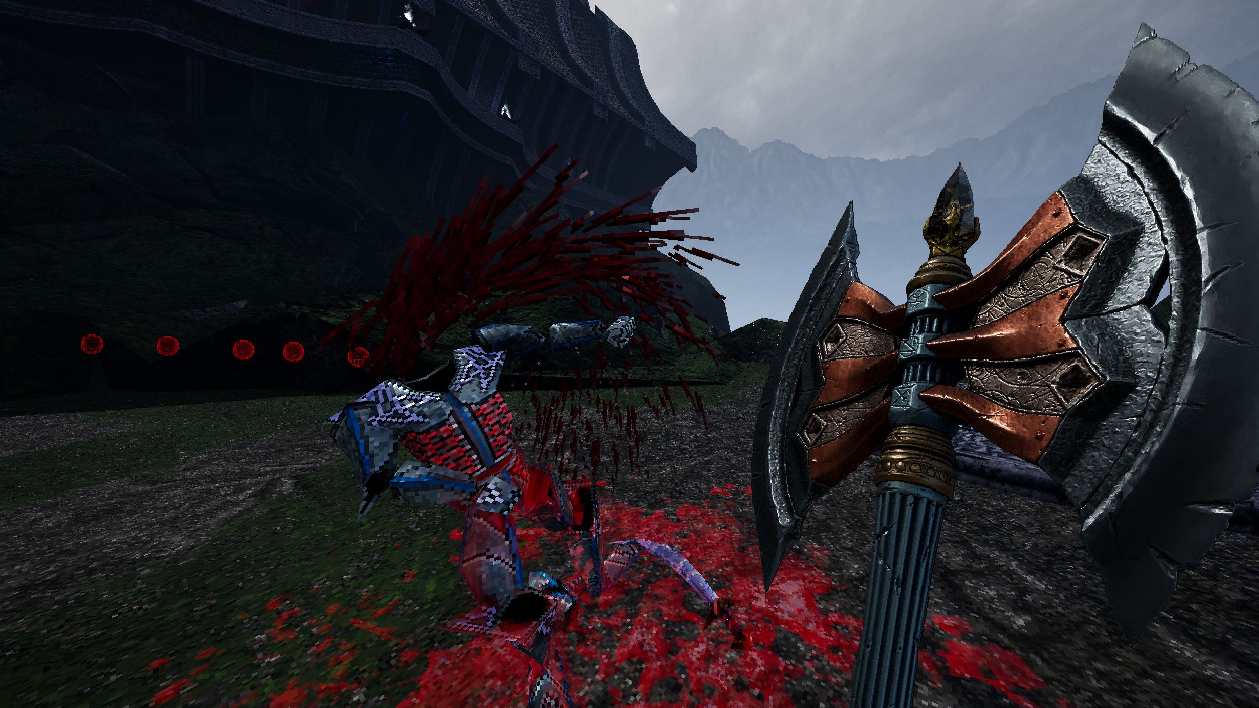
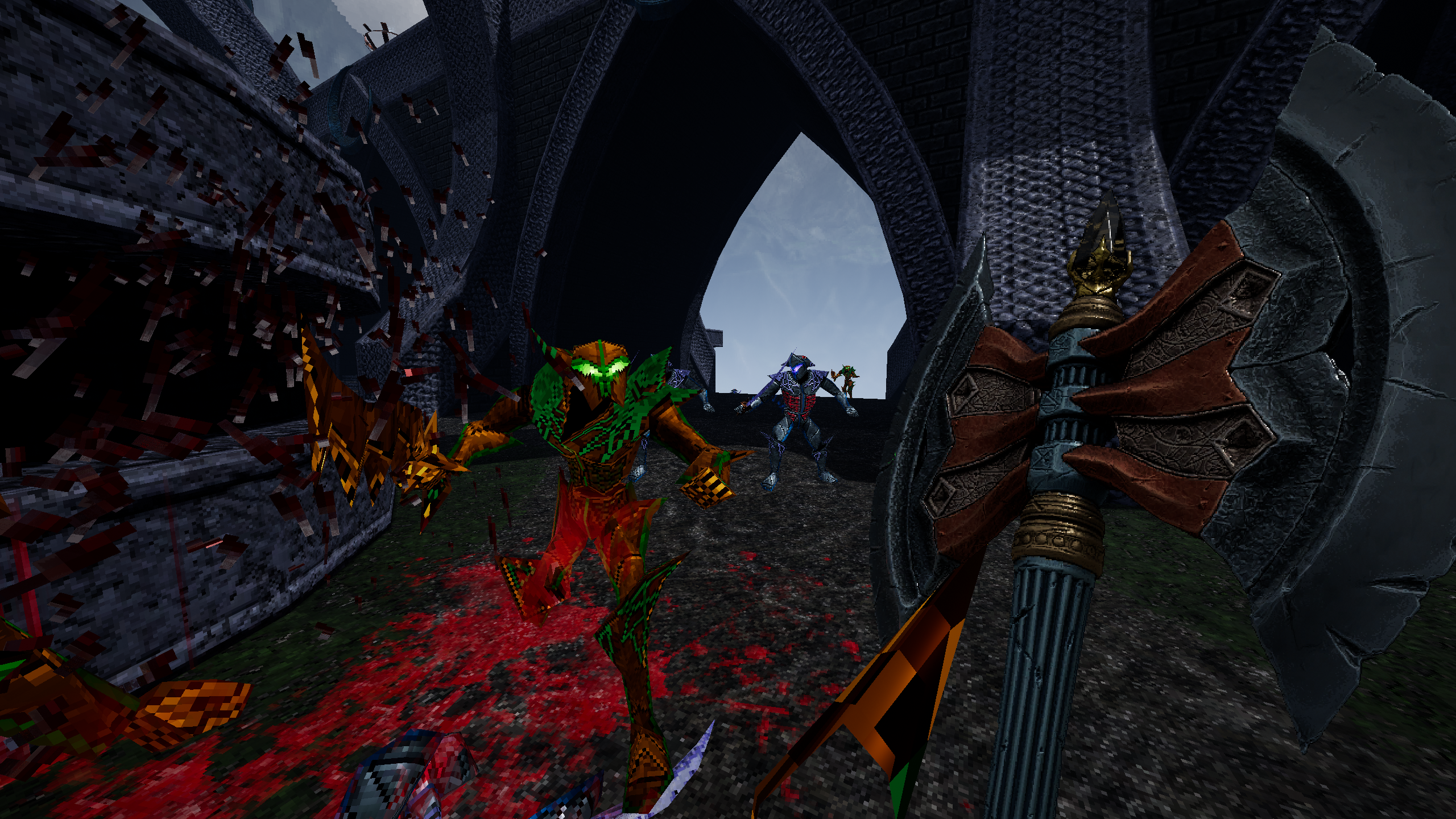
If you're going to emulate a retro style then do it consistently. Dusk might have looked like bargain bin rubbish from 1996 but its at least consistent with its ugliness. Just look at this shit https://cdn.mos.cms.futurecdn.net/S25Js28nX55W2wr7nxNtSL.jpg https://images.gamewatcherstatic.com/image/file/0/19/88490/673130_20171011213244_1.png The weapons aren't models they're sprites, but they're lit with modern PBR shading and it looks weird as hell. They're high resolution enough that you don't even notice that they're sprites so its a complete waste of time anyway. What makes it even worse is that the enemies are all 3D but their polycount and texture resolution is tiny by comparison to the weapons and they don't have the pbr shading that everything else does. The levels look like romhacks of Mario 64 bashed together in sketchup and are lit with such garish colours and noisy textures that it makes the PBR shading all the more tasteless with tiny bright specular highlights everywhere Then there's the particle effects which are in such abundance. The particles aren't even consistent with each other, some have 1bit alphas while others are blended and the blood particles don't match the decals they leave. And then there's dithering on the water. Its all so jarring its laughable. Whoever is responsible for this absolute mess of an art direction should be ashamed. You don't even have the excuse that Prodeus does by having a cool technical gimmick like having enemies be rendered as spites through a shader. And RockPaperShotgun is sucking its cock because of course they are. Anything with polygons and pretensions towards being 'retro' is a new Quake to those hacks Jean Baudrillard had a theory of "simulacra" - a copy of a copy of a copy, something that purports to represent reality but is in fact a perversion of an already distorted view of reality. Most of these "retro-style" developers seem to be creating simulacra.
Dusk is cool though.
|
| You must be logged in to post in this thread. |
| Website copyright © 2002-2024 John Fitzgibbons. All posts are copyright their respective authors. |