|
This is the version I hope to release for QExpo, should everything turn out to be bugfree.
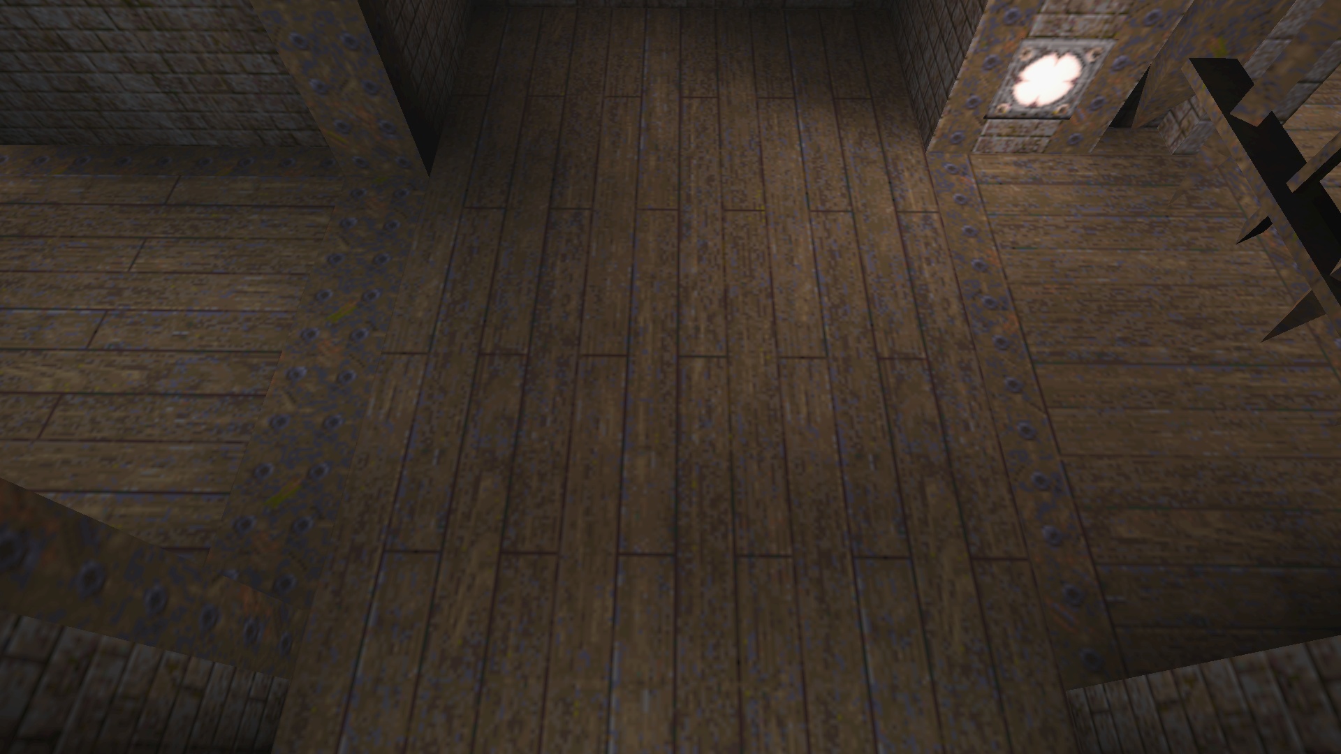
Dropbox link: https://db.tt/vvXGPDnv Yes, I finally worked out how to compile the thing for windows too. Here are two wood textures I made. I think I probably wasted a Saturday morning because I don't like them much. Better than wizwood1_8 maybe but they don't look enough like wood to me. The closer you are, the worse they look.
http://quaketastic.com/files/screen_shots/wish_rk_wood1.jpg (gamma corrected but forgot to rescale before uploading, sorry) Looks ok Rick. I think it may be a good idea to work at a higher res than 64x64. Try 128x128 and add some more variance here and there.
Well, those are 128x256 actually. I may go ahead and use them. For some reason though, they really look bad on steps. Maybe a separate version with narrower planks would look better, 8 pixels instead of 16 pixels.
After looking through a lot of texture wads I've decided that most wood textures depend heavily on context (how they are used). If not for the seams that divide them into planks and a bit of curviness to the pixels, most could pass for metal. There are many variations of wood in the RTCW and Kingpin wads. nice texture, maybe adding more variance as fifth said might make it nicer.
Maybe try making each board a different length so it's no perfectly symmetrical. Perhaps add more woodgrain to reinforce the idea that it's wood and not metal or stone. I did a texture test similar to this a few weeks ago, this is my result. Not great, but a step in the right direction. Maybe it will give you some ideas.
|
| You must be logged in to post in this thread. |
| Website copyright © 2002-2026 John Fitzgibbons. All posts are copyright their respective authors. |