|
I think that IF (and it's a kinda big if) you are going for a more surrealistic look then it has possibilities.
If you're going for realism then just no. That lighting is totally wrong. Think American McGee's Alice with odd floating bits for no reason other than to have them be odd floating bits (which may or may not be important to getting through the level). Have some fun with it and get a bit outside of the box with what you do. Be creative and people will respect you for that. That being said... Colored lights are very tricky, less is more in almost every case and if you do use it it has to be consistent across the entire level/episode (unless you use it to indicate a secret or some other important element). Look around the real world and there are very few instances where the lighting isn't white or close to it. Colored lights are used to attract attention but not for task lights or for everyday living (unless you live everyday in a LSD induced fog). I like it! See some comments inside the demos. https://www.quaddicted.com/files/temp/dom-beta-spirit.7z
Scale of the table felt off, that room needs detail too. Skill level seemed high normal or hard. Maybe have one knight patrol the big room? I never realised how different things looked on different monitors.
On my normal screen it looks pretty bad because the colours come out saturated and therefore very artificial. However, when I looked at on another monitor with both contrast and brightness set high (and I mean way over the top) I thought it looked great because there were no saturated colours but the colour was still visible. (do I remember someone releasing a discoQuake map where Ogres were dancing? I'm sure some collaboration would result in something er... different) thanks guys
it was definitely very Quake2 (I had the blue lights from Warehouse in mind). I'll post a subtler/modified version later. I quite like the way some of the lights mix into different hues, it just clashes with the Quake aesthetic (it does look very 1997, haha).
I think you should keep experimenting a bit more, never know what you might come up with. The Terminator 2 movie evoked the colors of a California (polluted) sunset by using blue and orange color gels:
http://timeentertainment.files.wordpress.com/2011/07/09_moviesequelsbetterthantheoriginals.jpg?w=480&h=320&crop=1 Also, if you wanna switch it up you can use warm ambient and cold direct light. Mappers rarely take that approach.
my favourite thing which is also really easy to do is to set sunlight/minlight colours.
Bright yellow sunlight + low (10-30) dark blue minlight can bring almost any outdoor scene to life. Another interesting combo is sikly yellow sunlight + vibrant green (but 10-30 intensity) minlight. You�re getting it wrong, global minlight is still evil.
What necros meant is faking global illumination based on various additive lights with delay 5 and pretty small values (as above stated 10-30 produces best looking results). Those lights are called minlights from now on. When compiling with tyrlight 0.14 use -addmin switch. And -soft1 -extra 4. Have fun! Next time rtfay! well no, i do mean normal minlight. but 10-30 is very dark anyway. just enough to give the blue colour and it's dark enough that you can still get nice shadows.
it's only when your global minlight starts going over 50 or something that it starts looking bad because it's just too bright and all your shadows disappear. with MH's version based on Aguire's you can. Maybe tyrlite too?
sunlight: _sunlight_color sunlight2: _sunlight_color2 minlight: _color and actually... now i come to think of it, it's not the minlight you would add color too, it's sunlight2 because you only want the colored shadows outdoors which is what sunlight2 is for.
sorry about the earlier post! forget the shit i wrote, obviously i am getting it wrong:)
My anti-knowledge is self-embarrassing as fuck.. Necros is right, thanks for explaining, now my map needs some retouch i think.. I abuse global minlight. My lighting abilities are abysmal so I use lots of monsters to cover that up. With your help I will light my next level properly.
In solidarity, and with Jesus' love. often means you have to make the lighting unrealistic or impractical for it to look nice. I will often obscure lights in a stupid way to cast shadows, in a real-world situation you'd be a maniac to do this but for a game it creates interesting shapes and can often disguise more simplistic geometry (id often did this for this very purpose).
Lighting large areas means putting a wide-area light (or multiple) inside the skybox, this is almost the same as having minlight as you get large coverage but you also get the advantage of dark shadows for contrast. I find lighting the easiest part of mapping, the hard part for me is making interesting combat situations (especially when it comes to end of map combat as a big finale) and run around it with "r_lightmap 1"
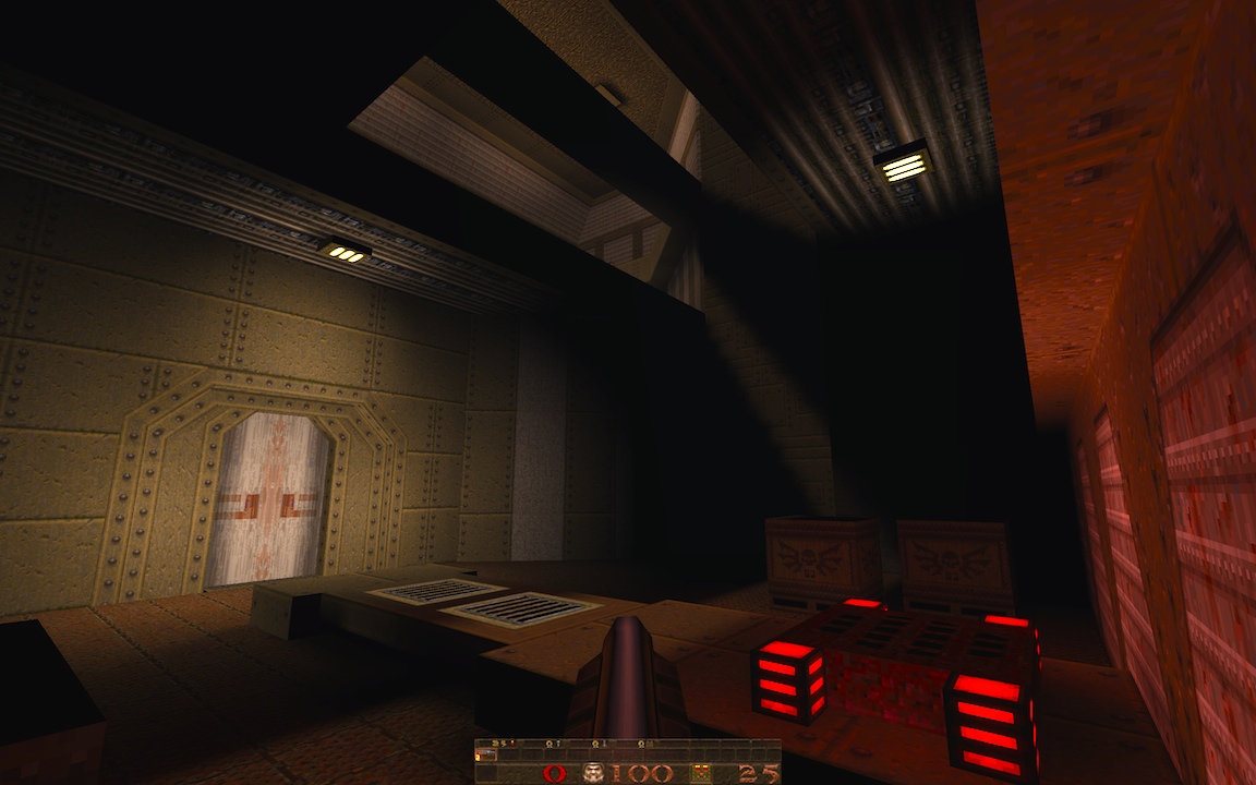
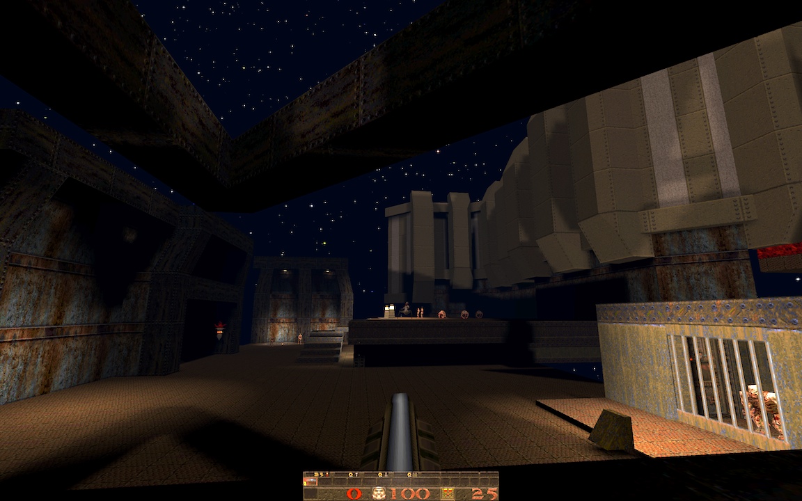
It might be that we're used to Quake having all white light, it might be that the palette doesn't work with a broad range of strong tints, or some of both, but there are really almost no cases in Quake that I can think of where even remotely saturated colored light (more than 10-20%) actually looks good. Maybe lava. However, as with any lighting, subtle colors well-chosen can look terrific. This is true in any game, but especially Quake. i've been having good luck with infinite lights: the shadow cast by the beam in the first shot, and the starlight in the second shot is from one point light on each side of the skybox (it's currently a map inside of a giant cube of sky..)
http://quaketastic.com/files/screen_shots/ericw_station_1.jpg http://quaketastic.com/files/screen_shots/ericw_station_2.jpg The red light from the slipgate in the first shot is probably oversaturated. For the second shot, I need to do something with that wide swath of flooring, for both gameplay and visuals.
|
| You must be logged in to post in this thread. |
| Website copyright © 2002-2026 John Fitzgibbons. All posts are copyright their respective authors. |