|
i've been having good luck with infinite lights: the shadow cast by the beam in the first shot, and the starlight in the second shot is from one point light on each side of the skybox (it's currently a map inside of a giant cube of sky..)
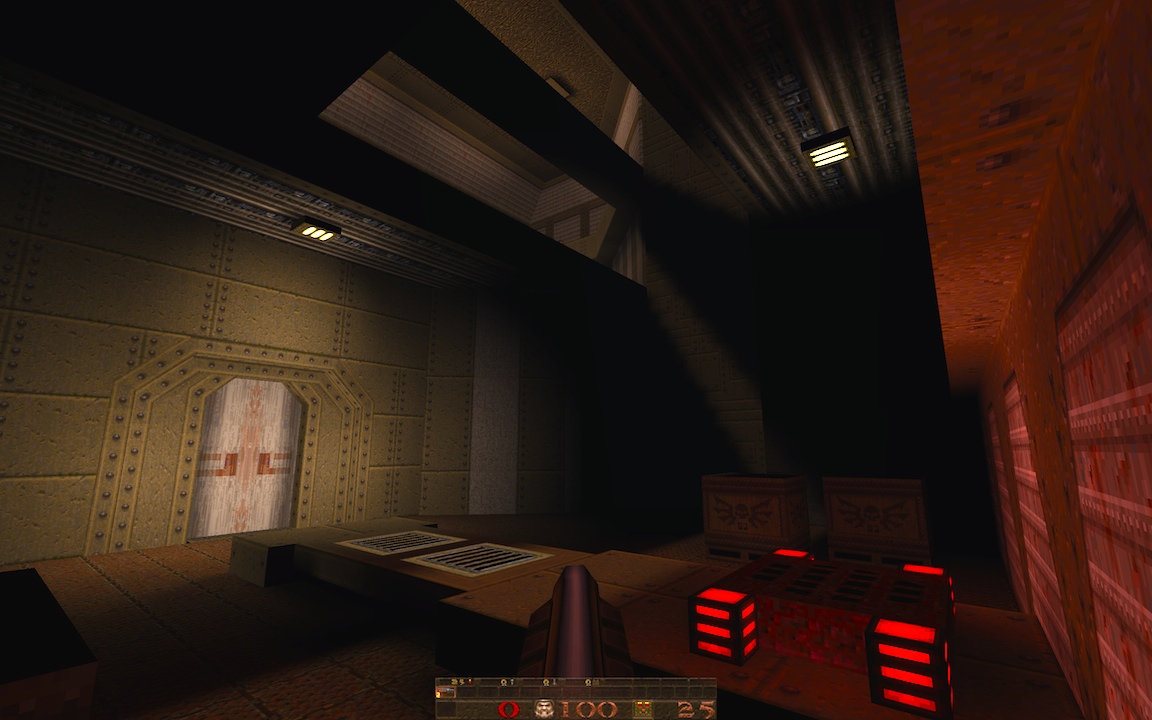
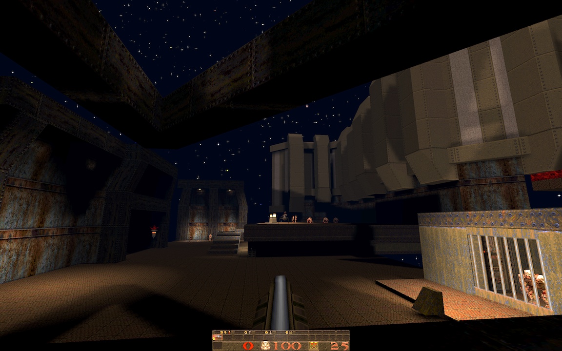
http://quaketastic.com/files/screen_shots/ericw_station_1.jpg http://quaketastic.com/files/screen_shots/ericw_station_2.jpg The red light from the slipgate in the first shot is probably oversaturated. For the second shot, I need to do something with that wide swath of flooring, for both gameplay and visuals. The brushwork and lighting is good, good work!, but
And are you using blue fog? it goes well with the brushes at the bottom, but doesn't look so well for the sky. Maybe it is that i never got the fog right in Quake 1 - First shot looks very promising.l Maybe some detail in the wall around the door, make one of the panels go 8 units out of it. Where is the transparency? I can't find it, RoQ. I got interested. - About Tronyn colorful screenshot, i agree with Quaketree there, could look good on an otherwordly theme or for a for the fun map. But above everythihg, keep trying, maybe you'll get something unexpectedly good. I miss the experimental maps that we saw a lot back in the 90's, even those that looked terrible visually. Now the trend is professional looking maps. Not that it is bad, but more variety would be good. thanks for the feedback. The textures in the second shot do clash, it's sort of two bases in one map (an idbase-textured base, and a rusty ogro and speedbase textured base). I'll try to do something to fix the part on the right where the rusty wall panels are touching the idbase chunk.
There is a faint blue fog, yeah. "0.015 0.01 0.02 0.04" maybe it's too blue? The bars of the ogre cage are a doom sprite displayed with a (quoth) mapobject_custom. I love sprites! Only problem is they render as fullbright, so you have to have a bright light on them to hide the fact. you can see the grill sprites by the slipgate in the first shot stick out because the brushwork isn't lit enough. ijed, yeah a crate maze could be good, I'll try it out. I miss the experimental maps that we saw a lot back in the 90's, even those that looked terrible visually. Now the trend is professional looking maps. Not that it is bad, but more variety would be good.
Thank god we still have Madfox 8-) ... isn't experimental, his layout is. His brushwork, more than classic, should be classsified as idish in style.
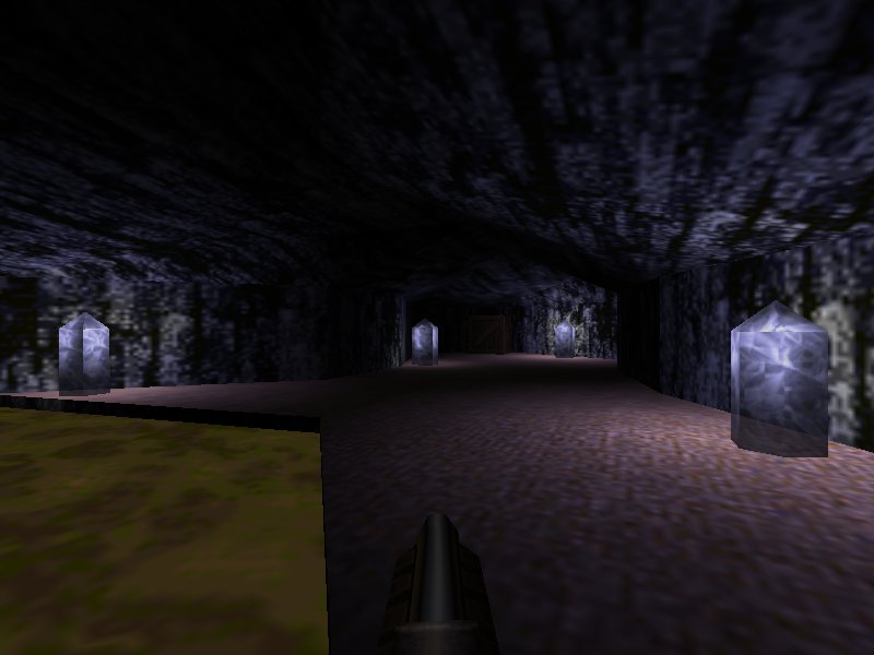
Recent examples of experimental maps, i would say, Nyarlahotep, ITS, Ascending as descending, sm170, sm172, etc. http://www.quaketastic.com/files/screen_shots/q70v05b.jpg
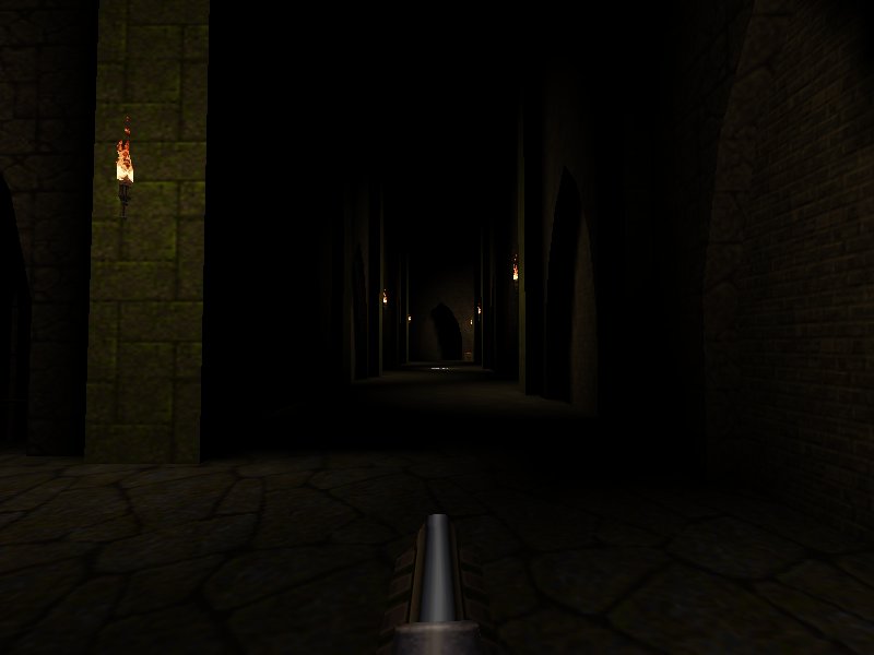
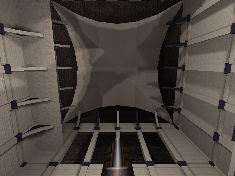
I haven't goten any good lighting into these after hours of tries. I want it so the monsters are lighted when they go near the torches but are mostly in the dark the rest of the time, but i don't want to lower the torches even more. I suppose the answer is doubling the number of lights, but http://www.quaketastic.com/files/screen_shots/q73v03_400_3.jpg http://www.quaketastic.com/files/screen_shots/qep73v03c_400_2.1.jpg Any ideas for this ceiling? Nothing i tried convinced me. The lighting will change in the future. http://www.quaketastic.com/files/screen_shots/qep73b03.jpg if you can't figure out what to put on a ceiling, just cloak it in darkness! :D
for the first shot, there isn't much you can do to make better lighting there because the brushwork doesn't really allow for anything. if you had rougher stones and things jutting out that could cast shadows, that would certainly help. for the second and third shots, try putting the light down by the base of the pillars instead of high up and put them in the little corner where there's the inset arch so it casts shadows. looks like it's coming along quite well. one thing i really like about doom mapping is just how fast moving the whole process is.
just be careful with doing the lighting effects because if you need to change the area later, it can be really annoying having to deal with all those sectors. it's fun and easy to get into!
doom builder: http://www.doombuilder.com/ slade (in beta): http://slade.mancubus.net/ Seriously though that's a potentially interesting bit of topology for moving/fighting around, and I've always liked the mossy-block Quake texture set as being one of the "most Quake-ish". Keep fiddling with the lighting.
The full version of that texture set has a lot more textures, but for some reason I don't have it in a cloud service anywhere.
I'll check on my local drives tonight for it.
|
| You must be logged in to post in this thread. |
| Website copyright © 2002-2026 John Fitzgibbons. All posts are copyright their respective authors. |