|
Both skacky and nitin are correct. You should go for all colored, and grognards like me can then simply delete the
...three hours of work this arvo and now my mapping computer won't boot. Let's hope the guys in ICT can help tomorrow,
Had an awesome under lift secret - it was a teleporter you could hear when the lift brought you down.
it combined an under-the-lift secret with a quad-after-you've-killed-all-the-monsters secret
I was waiting for someone to bring that up. I thought it looked fine. The red maybe had a little too much "reach" and the blue might have been slightly over saturated, but that's just opinion on my part. I wouldn't change it much.
Anyone that doesn't like colored lighting probably has seen too many games or game levels where it was done poorly. It adds a lot to Quake if done well, and anyone that doesn't incorporate it into their maps is probably some kind of Luddite. the "no color" shot looks the best (except for the light being a little too bright), but i would try starting from that and adding a tiny bit of red light that is localized around each light fixture. What you have no in the "no blue" shot has the problem that the entire room is purple because the red light is the primary fill light.
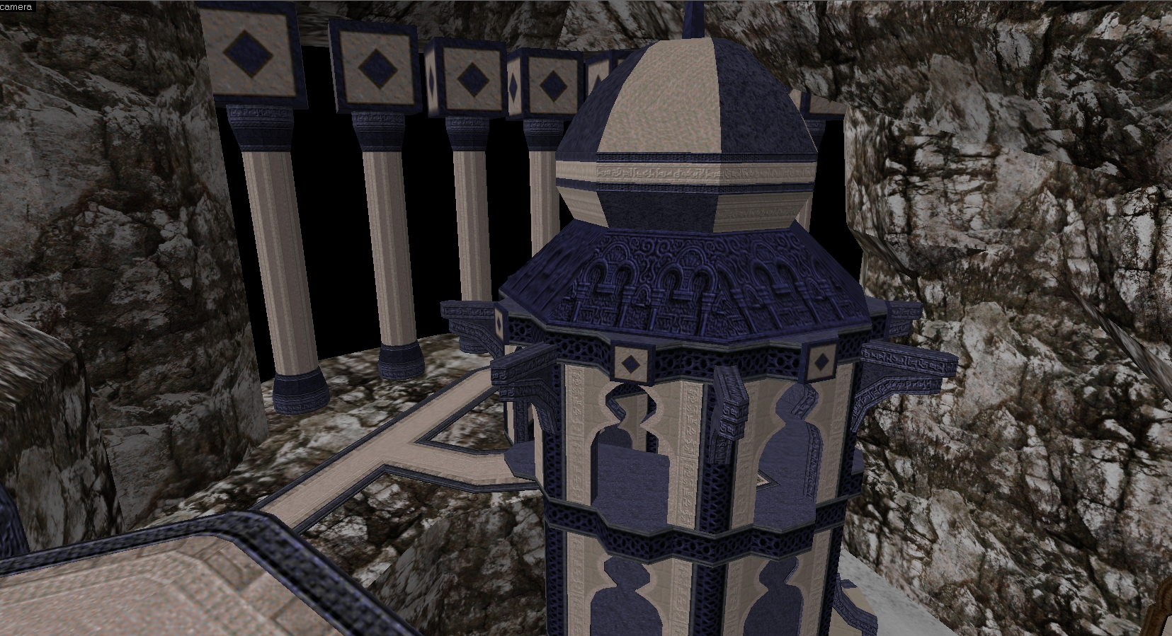
Kinda looks like a new texture set almost ;) Are any of those stock ikblue? There are like, 8 textures in the entire ikblue set :/
For anyone that still has idgamma, ikwhite is completely unuseable and looks like unbelievable shit in game.
I just found this out as I was playing with ikwhite. A simple trip into id1 to rename the offending pak (in my case it was pak3.pak) fixed things. Now I can kind of see some details again. Unfortunately, everything else looks dark and bland now :( I think idgamma adjusted the contrast of the palette as well as the brightness, since increasing the brightness in fq doesn't really help :( idgamma has a more complicated formula that messes with contrast and brightness and some other stuff probably. I assume you have to mess with multiple sliders? I've never used it.
Fitzquake gamma just recreates the software engine gamma basically. Maybe someone will re-create the idgamma controls inside a quake engine, then people can delete their idgamma pak files. On the other hand, that would result in anything TGA-based being brightened in the same way. I guess people who use idgamma are used to TGAs being dark and dim compared to 8-bit paletted textures. So they probably wouldn't like that. well the week is just about over and I haven't done any lighting yet, so I'm unsure if I'll make the deadline (it's definitely possible), but here's another editor shot anyway:
http://www.quaketastic.com/files/screen_shots/ikblight3.jpg @ijed, glad you spotted some of the angles, most of them are subtle, except the doorway silhouettes, I wanted them to stand out.
@Drew, well the door, wall and arch supports are just prefabs and texture tests, which is why it looks like a corridor. @than, as you have no doubt discovered the ikblue set is really small and lacks a lot of trims. I have converted some of the ikwhite to blue and swapped some of the pixel noise for stock id textures. I am trying to fill in the gaps so it easier to work with for my map. @Tronyn, it looks epic, but remember giant maps take a long time to create/light/test, also look at func_detail to speed up compile times.
|
| This thread has been closed by a moderator. |
| Website copyright © 2002-2026 John Fitzgibbons. All posts are copyright their respective authors. |