|
Keeping you updated!
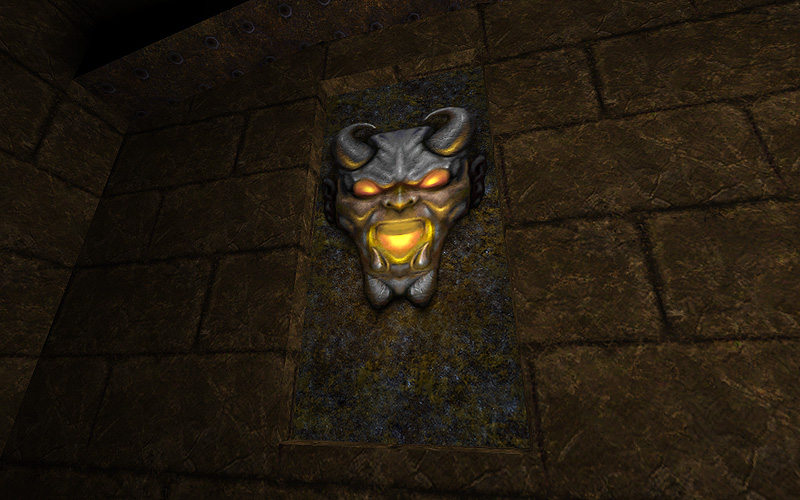
Some textures take longer than others, really happy with this one though. http://www.quaketastic.com/upload/files/screen_shots/e1m2_tex3.jpg Starbuck, wow! NOW that is a lovely texture. My only nitpick is I wish you cut the wall texture to line up with the brick pattern! grrr, stuff like that drives me nuts. :P
very cool tex, only one concern: his upper jaw' teeth look as proper hollywood smile, i'd add a couple of fangs there ;)
Zwiffle
haha I'll never unsee the :D face now! Maybe will have to tweak it... [Kona] http://img121.imageshack.us/img121/2559/e1m2tex3old.jpg Sock Cheers! I love your texture work by the way. You're right about the brick pattern not lining up to the edge - kind of a legacy problem, but I'll probably fix it anyway... that stuff annoys me also :) Vondur If Vondur wants fangs, Vondur gets fangs. This is just one of those life rules. Medieval Courtyard
Image : http://www.simonoc.com/images/design/maps_q3/mcourt1l.jpg Website : http://www.simonoc.com/pages/design/maps_q3/mcourt.htm There are plenty more screenshots on my website if you are interested in seeing other angles. The images are designed to be darkish and moody and could appear too dark for some people. I tested them with several friends and this was the most popular brightness setting. If you have any favourite images or feedback on screenshot brightness levels, please let me know. The map is just a visual doodle, no gameplay! 3 shots from my current project... progressing slowly, but progressing ;)
http://lambert.jeanphilippe.free.fr/Divers/GTH05.JPG http://lambert.jeanphilippe.free.fr/Divers/GTH06.JPG http://lambert.jeanphilippe.free.fr/Divers/GTH07.JPG Maybe too dark... and as usual, comments are welcome :) very nice. My favourite shot is the first one, but I also like:
http://www.simonoc.com/images/design/maps_q3/mcourt7l.jpg and the simple corridor looking out the window one. The brightness works fine on my screen. My immediate impression of the lighting is very good, but that it's a bit too saturated around the torches. I like how the light is so intense nearer to the flame, but the falloff is a little abrupt. It might be nice to have another yellow light with a wider radius and less brightness, that just adds a touch of that yellow color to the surrounding wall. Cool stuff. JPL: Nice. But seriously, don't use minlight. Try it and you will see the difference.
sock: Nice. Glassman'ish. It saddens me to see how you keep churning out new Q3 stuff while I haven't even started making up for my pathetic attempts... Sock: Looks like Oblivion - cool shit.
JPL: Looks cool but also very drab. Dunno why, but the screen shots look washed out (is it minlight? I thought it was just the Contrast or whatever turned way down.) Maybe it's because I just played through Mirror's Edge but color seems to be the wave of the future! JPL, looks good, big up medieval style, keep it going.
Sock, very nice. What's happening to MOTEOF?? @Sock: Why not center the windows in the outside shots so that they aren't immediately next to the towers?
@JPL: I think the drabness might be the textures. Those columns against that brick wall over that tiled floor...nothing pops! to nitpick, please replace that cobweb/marble or whatever it's supposed to be, texture on the pillars. I've always wondered how TF that texture got into the otherwise great DKTE3 set when it looks like something ripped from Duke3d. seriously, go for something more solid looking. Second, and this might be heresy, put the minlight up so that the shadowed areas actually still have some texture - BUT at the same time, add more real light sources. I realize that this is how I do things and I do mostly outdoors, but you've built the architecture now let us see it, and your map does appear outdoorsish. Indoor dungeon/zer/elder world darkness is different but in this case, let us see the architecture.
Starbuck: yey! hope they won't be too big to destroy the original image ;)
sock: that castle is impressive! Is http://www.simonoc.com/pages/materials/tpmedieval/index.htm not intended for download yet? I cannot find the link but I really want those!
@Starbuck: Oh I did not realise that texture alignment issue was in the original map. I never really noticed all those years ago. I look at maps a lot different nowadays.
@JPL: You need a bright sky, the black sky + dark textures makes everything too dark and bland. Also can you get higher resolution textures? The existing one's look very blurry. I like the architecture and attention to detail with broken pillars but you need to make it feel outdoors. I am never a fan of the black sky thing, it just seems a waste of pixels when you could create a cool sky vista instead. @negke: The map is just a doodle, nothing special just an experiment with architecture. Find a photo of something you like and just build it, instead of getting involved in gameplay all the time. @Zwiffle: Thanks :) @Shambler: Edge of forever is nearly ready, I have been waiting for the VO to be recorded. If things go right with testers it should be available this weekend! :) @generic: The windows outside line up with the architecture inside and the original source image of Hampton Court placed the windows next to the outside wall support. Initial position of everything came from the source image. @Vondur, thanks :) @Spirit, I will release the textures once I release the edge of forever map. I have been waiting for the VO to be recorded, everything is finished. The texture pack page is just a placeholder at the moment, I will add the download link soon.
|
| You must be logged in to post in this thread. |
| Website copyright © 2002-2026 John Fitzgibbons. All posts are copyright their respective authors. |