|
Was just idle experimentation really. Whilst I tip my hat to those who struggle to colour within the lines of bsp1 limits, I decided not to bother with it.
The internalizer you mention in fact sounds something like the skip utility, which moved brush face around so they wouldn't be visible. <@Bal> http://www.born-robotic.net/content/maps/balostepisode.zip
<@sock> someone should re-work them into maps with vanilla gameplay Too bad there aren't much monsters to fight, in these giant maps.
I guess I'll have to play them with the DMSP mod. Oh lord these maps look great. I can't believe these are sitting around unfinished. None of my scrap levels are anywhere near this kind of quality or completion (I usually rough out a couple of rooms, you seem to make entire maps!)
Those superb maps doesn't do anything with the DMSP mod. WTF !?
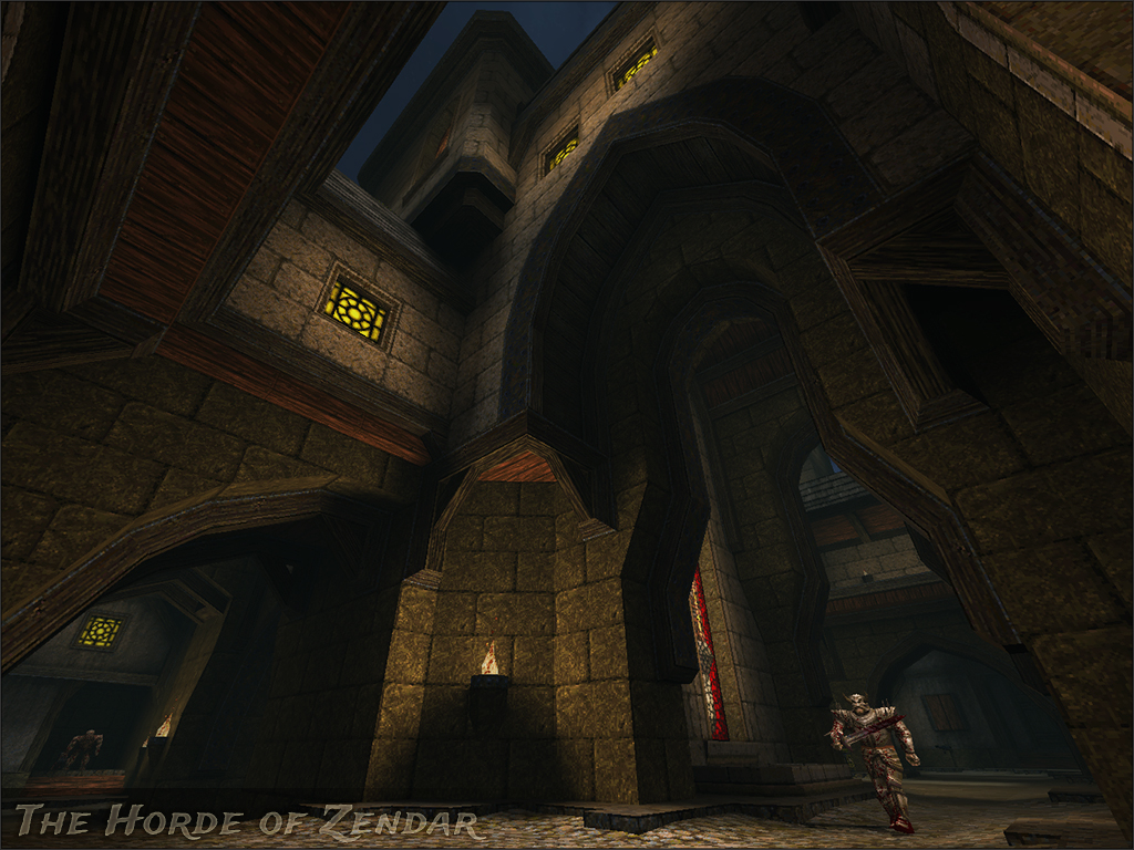
Why, O why Lord !? The b1blue, b1office and b1rocks are so cool, why not finish'em ?? There are no deathmatch starts in those maps, which is why they won't work with dmsp. The map files are there though, so I guess it'd be fairly quick to throw some in and -onlyents compile.
Extending Daikatana mainmenu graphics for widescreen support. Fun!
http://spiney.me/files/etc/back0.png I like it, very quaint. Almost thief-like in some respects.
Not everything has to be some outrageous structure. I'm kind of surprised since I usually love the yellow windows, but I agree with mfx. They don't look bad but maybe a more toned down intensity or different colour would be better? Might be worth tinkering with.
Such a minor thing, but of course it's hard to find serious flaws with your shots. I don't think the windows are too yellow, I think they are lit too brightly.
I can see a shadow on the ground, which gives me a light source, and the walls around the windows are lit but it cannot be coming from that same light source. So if it were me, but it's not, I would either reduce the Light or move the light closer to the window so there is less 'overspill'. Other than that, very pretty. I like it Sock, very fresh! Which is hard enough to do in Quake. As been said, the yellow windows steal a bit too much attention, although I like their contribution to the color palette. Maybe having some yellow oil lamps on the walls could be an interesting idea to have in certain areas, to get some variation from the usual torches.
Also, the stone wall above the stucco (?) housing seems like to heavy a structure to be on top of those. I'm kind of hoping this'll start a trend for some Tuscan/Venetian village like maps :P Looks fine to me, although that kind of bleeding makes me think it'd be better in a twilight / early evening setting.
A darker sky and some very mild dark blue fog... Random idea, and we all love spouting those off. Village maps are great.
|
| You must be logged in to post in this thread. |
| Website copyright © 2002-2026 John Fitzgibbons. All posts are copyright their respective authors. |