|
haha tronyn, 15 years since shambler refused to review my first episode as well! he was offended I even thought he'd consider putting it on his site.
re start map, fifth that just looks like id's start map. what's the difference? if you're going to do big changes to the other maps, why not the start map as well? it could have a lot more detail added. You'd be surprised at how different they actually are side-by-side. Mine is meatier with more detail and more defined lighting.
I might do a second pass on it once it's finished to make it feel a bit more unique anyway. I don't want to overdo the detail though as id maps were simplistic (and my intent is to actually release more maps per year). Did some more work on the dam interior.
http://i.imgur.com/9dUwQhP.jpg http://i.imgur.com/efaZ1RH.jpg http://i.imgur.com/c5Nn3TT.jpg WTF was he playing at??
On the plus side there does seem to be a correlation between having early maps rejected and then becoming a prolific and consistently good mapper :P well also Shambler, as you pointed out, at some point the general quality of maps became so good that even someone's first map was worth reviewing
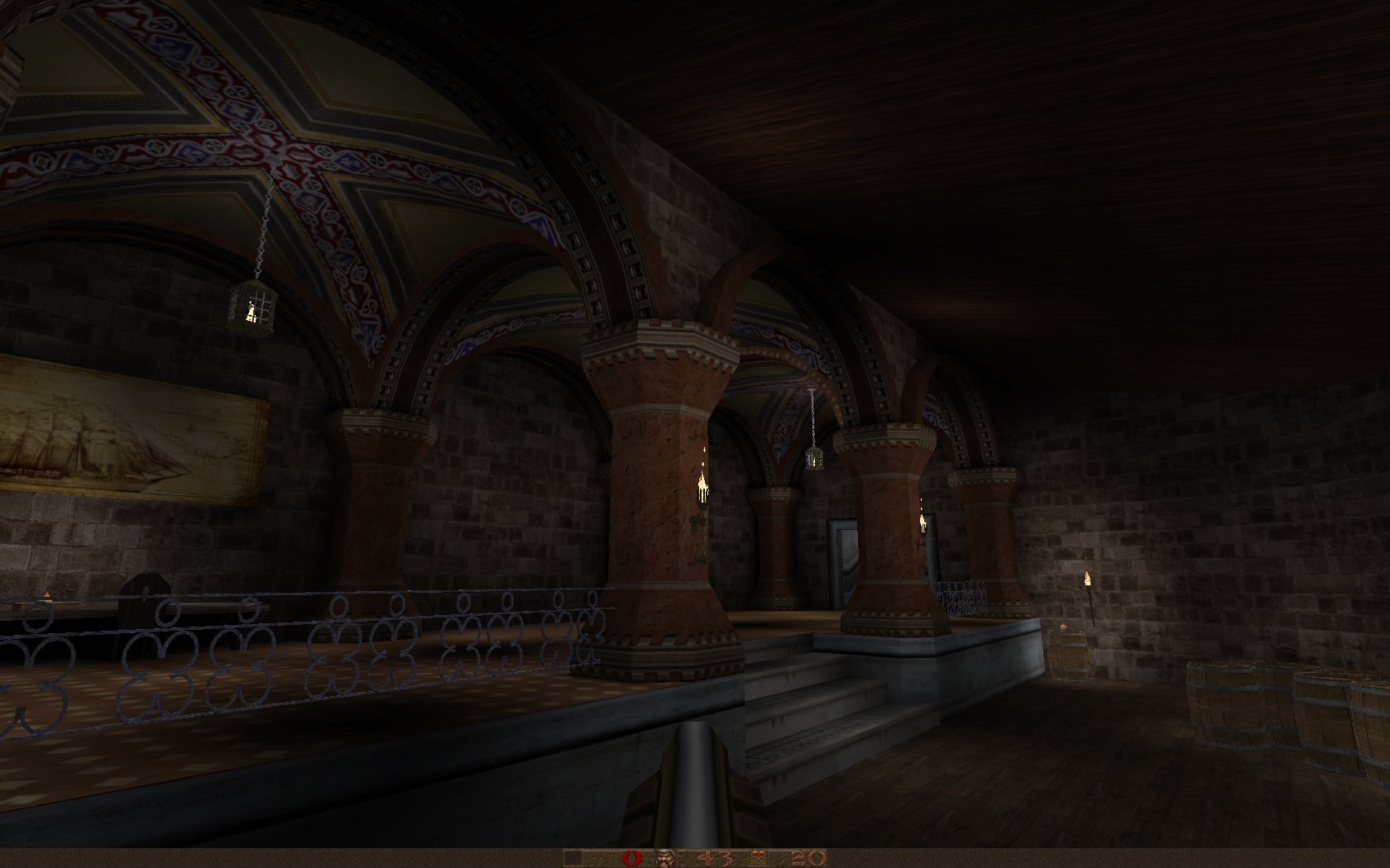
Nice architecture and texturing, but the lighting looks flat - maybe take some cues from sock's maps to improve it?
I replayed the Alkado Crisis just before this "issue" raised its head and... not that it stopped me from being in awe back in the day :)
@Mechtech: wow.... really nice and awesome arch texturing... hats-off..
haha distans I didn't even know that episode was still online anywhere, I thought I'd eradicated it from all existence!
we all start out somewhere making crap before we get decent. i guess to get pretty good it could take a good 50-100 hours, depending on the individual and how patient they are to improve. i wonder what some of the early id levels were like, because I bet there was some early stuff in the learning phase that didn't make the cut. what did they do in the first 100 hours of level development... Some the the textures are from The Florentine Library by Sock. Still doing broad strokes. I want to get to the end, whatever that's going to be and fill in the monsters, lighting and skill specific stuff. I also want to find a good subtle fog setting. Any suggestions? using Fitz
The models are nice, but they do look a bit flimsy when compared to the big rustic architecture of Quake. Got to thicken up the details a bit to prevent it from looking 'unnaturally realistic'. I think you could do some interesting things with the ceilings not typically seen in Q1
Gotta agree with the comments about thin details looking wrong in quake.
Quake's combination of low-res textures and lightmaps, and lack of smooth light shading across polygon facets, all combine to make fiddly details look weird and wrong imo. Quake is best when painted in broad brushstrokes I reckon, although strangely the super-thin fence/bar stuff in czg's honey worked really well, so add the usual arse-talking disclaimer to my generalisation there. but it does happen.
Usually these are minor details anyway.
|
| You must be logged in to post in this thread. |
| Website copyright © 2002-2026 John Fitzgibbons. All posts are copyright their respective authors. |