|
For any that are interested :)
http://www.l4dmaps.com/details.php?file=11517 Amazing map. I really like what you've done with the apartments, it makes them feel much more dangerous. Spreading the weapons out more helps as well, though I'd suggest having one or two more next to either the start trigger or the spawn point for those players who don't enjoy exploration so much.
I only found one "bug" in this version. Near the start trigger, if you climb up the generator and the lamp on top of it you can get on to the four vertical girders. This is a fun place to snipe from but unfortunately tanks and common infected can't climb up to you, meaning the only infected that really stand a chance of hurting you are smokers and spitters. Also, if you are unlucky enough to be incapacitated or knocked down by either of the afforementioned when you're up here the bots don't try to revive you as I guess you're out of their reach too. So I'm playing with maps that actually give you powerful weapons :)
If anyone likes horde fights you can test it :E Thanks once again, I had no idea you could get up there! Seeing that bug made me go on a mad clipping spree around the map to make sure no other craziness could happen :)
Added some low tier weapons to the spawn position, the lazies will have to put some effort in to get better weapons ;) Next release will be final I think, unless I find anything showstopping! Finally decided to strip most of the end area of my Base map out for performance and vertex count reasons
http://www.zealousquakefan.com/wp-content/uploads/2011/08/zqftest03_construction70.jpg Will still have some meaty fights in it, though I apologise for the crate maze factor :E Looks really cool zqf. Maybe vary those crates a little - have some of them rotated or off-center instead of these long straight walls?
I gotta finish the geometry before I worry about textures :/ PS will need to have it tested again since a lot has changed since you chaps played it. If you want to try it again I'll send you a new version.
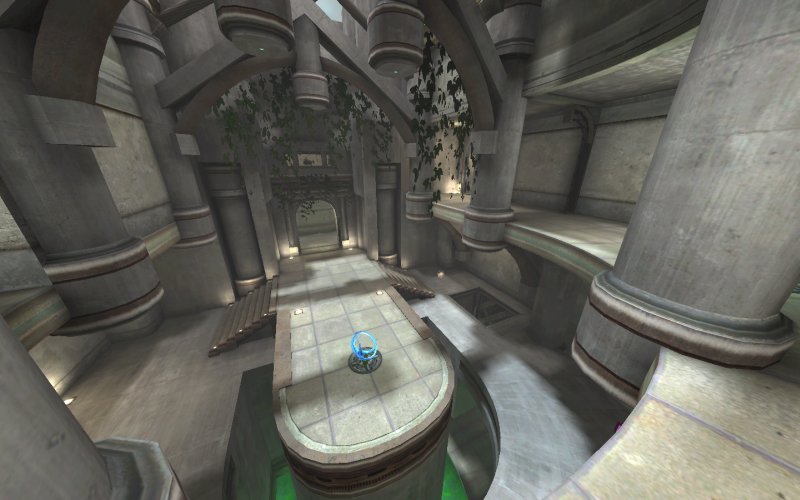
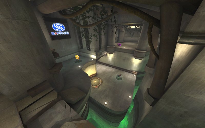
That's really elegant. I'm a fan of that style. I don't like the green pool though, I would suggest changing it to a blue color personally, but it doesn't destroy the look for me.
|
| You must be logged in to post in this thread. |
| Website copyright © 2002-2026 John Fitzgibbons. All posts are copyright their respective authors. |