|
If it's on the edge of forever, who is going to be reading books there?
Ever read The Bridge by Iain Banks? (I think I mean The Bridge, it might be another one of his (non-sci-fi) books). The bit with the old man and woman constantly playing board games in some giant castle/tower in the middle of icey nowhere. It's kinda like that. And some of the later WoW instances, especially in the expansion packs, are masterful pieces of gameplay/level design. I'd be proud to have made one of them. (I love that game so much I had to go through rehab ;) The puzzle element and graphic style are very reminiscent (especially those exterior shots with the eaves). Actually, I always wanted to make a level based on the bridge city from The Bridge. A section of an infinite bridge covered in art-noveau/retro future style houses/stores/buildings...
The latest expansion pack of wow has some jaw dropping amazing instances, the art and style is just perfect. Everything is large because of gameplay reasons (no one wants to fight bosses in cupboards, plus it be would exploited like crazy) but yet there are small alcoves and sections with details that bring everything together on consistancy. The instances are where wow shines the most for me, the huge game world is cool but the real wow factor is indoors.
Last weekend I had a small mapping break from my forever map and decided to try an experiment with rich coloured lighting, decals and sky portals. http://www.simonoc.com/images/design/maps_q3/focal1ac1l_1024.jpg http://www.simonoc.com/images/design/maps_q3/focal1ac1l_1024.jpg The above screenshots feature simple blue panels wrapped around geo architecture and accented with gold and blue lighting. Most of the time was spent with the animated item marker on the floor. I really wanted the decal to maintain edge shadows, have solid fill colours and yet be a decal at the same time! Something I always find lacking in my maps is the connection between world geometry and skybox, so the next experiment was connecting this together with various shaders, models and a portal skybox. http://www.simonoc.com/images/design/maps_q3/focal1ac3l_1024.jpg http://www.simonoc.com/images/design/maps_q3/focal1ac4l_1024.jpg The blue light beam flows upwards to the portal sky and the models in the portal sky then carry on the illusion up to multiple swirling cloud layers which gradually alpha away to blue sky horizon. The architecture around the focal point is just to accent the view upwards and make the players viewpoint vertical. Ooops I messed up one of the screenshot links, so here is the first two again, but correct links:
http://www.simonoc.com/images/design/maps_q3/focal1ac1l_1024.jpg http://www.simonoc.com/images/design/maps_q3/focal1ac2l_1024.jpg I really like this style: cartoon-ish but design advanced... it looks like a fan-art map :)
It reminds me a lot the Willem's White Room Q1SP... Good job :) what willem drinks in the morning! Wow now that must be some serious coffeeeeeeeee! :)
Yeah it just a doodle map, nothing serious or playable, just playing with q3map2 tech. Seriously, why so few people post screenshots of what they are mapping? :( ... either nobody is actually mapping, or current projects are not progressing as stucked in the limbs of Hell (my case) :P
Might post a screenie or two as it gets towards completion.
As for ever getting to play it - well if enough people work on maps for the rest of the project it might actually get released before the apocalypse in 2012 Seriously, why so few people post screenshots of what they are mapping? :(
i have gotten into the mindset lately of not wanted to 'spoil' any of my maps by posting screenshots. i don't know if that's dumb or not though. :P Going back to the mapping process post, personally I work in an iterative way, so if something is close enough to detailed that I could post a shot then it's probably pretty near finished...
(Not that I ever finish a map) Producing screenshots is easy...
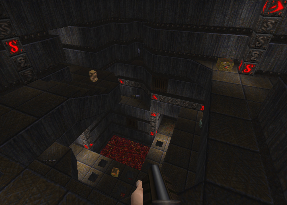
http://img4.imageshack.us/img4/3084/wunzee.jpg but what is difficult... http://img42.imageshack.us/img42/2346/toozeep.jpg is producing the map... http://img42.imageshack.us/img42/8004/fweezee.jpg afterwards! http://img3.imageshack.us/img3/5016/forzee.jpg holy wowasaurus! Mike I did not think Q1 could look that good! Awesome cave stuff and the fog in some of those screenshots is gorgeous. Please post more! :D
ijed, very cool :) I WANT MORE SCREENSHOTS Top right in your first shot is beautiful Mike. Love the bridge/underground cavern.
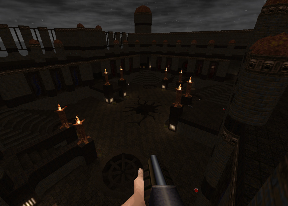
And good, novel theme in the 3rd shot ijed, that hole in the ground is very nice... mike:
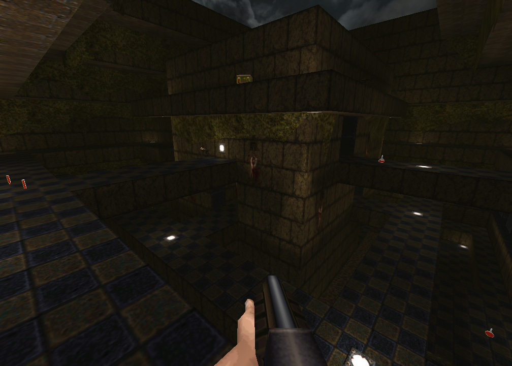
as i said earlier, all those shots are great looking. i'd suggest reworking that brick texture. it's 128x128 atm, consider modifying it to be 256x256 or even 512x512. just tile it at the larger size and play with the colour shading to add more variety so that it doesn't appear to obviously tiling on wide, open swathes of brushwork (ex: shot2, bottom-right quadrant) also, epic bridges over lava with detailed terrain around the base = win. ijed: shot 1: ok, but really cramped. obviously, that's the point since it's a remake of dm4. i never liked that map in it's original form either. (e3m7 is also cramped like that) so can't really fault anything with the remake version. good on your texture alignment, btw. maybe work some vertical aligned brushwork into the uppermost areas? the horizontal striping is fine at the bottom where it's broken up with hallway openings and such, but it's undisturbed at the top which makes it look repetitive. shot 2: plain, except for that undergrowth of leaves, which is nice. it's a dm map though, so i guess the lack of detail is sort of par for the course. it'd be great if you could work some trim into the edges of those bridges and some supports and stuff. shot 3: easily the best of the three, very cool with the sweeping curved staircases and the details up at the top area. too often (in other's maps as well as my own) the top area at the sky is ignored in favour of plain walls or whatever. it's a tad monolithic with those mini-domes in the far side of the room in that shot. braziers are nice, are those brush or mesh models? either way, very cool. both the cracked hole and the wheel-type grate next to the gun are nice too.
|
| You must be logged in to post in this thread. |
| Website copyright © 2002-2026 John Fitzgibbons. All posts are copyright their respective authors. |